400개가 넘는 메뉴가 담긴 수퍼플랫폼, 신한 SOL 뱅킹. 속도와 기능을 쫓는 사이 사용자 경험은 파편화되었습니다. 저는 그 파편들을 다시 정렬하는 일을 했습니다. Shinhan SOL Banking: a super-platform with over 400 menus. In the race for speed and features, the user experience fragmented. My job was to put the pieces back together.
Overview
"메뉴가 너무 많아서 내가 뭘 찾아야 하는지 모르겠어요."
"There are so many menus I can't figure out what I'm even looking for."
사용자 인터뷰 중, 신한 SOL 앱 From a user interview, Shinhan SOL App
2018년 수퍼플랫폼을 지향하며 오픈한 신한 SOL은 뱅킹, 자산, 보험, 증권, 외환을 하나의 앱에 담았습니다. 야심 찬 전략이었지만, 빠른 기능 확장의 결과로 400개가 넘는 메뉴가 쌓였습니다. 메뉴는 늘었지만 사용자가 원하는 것을 쉽게 찾을 수 있는지는 별개의 문제였습니다. Launched in 2018 with super-platform ambitions, Shinhan SOL packed banking, assets, insurance, securities, and FX into a single app. An ambitious strategy — but rapid feature expansion resulted in 400+ menus. The number of menus grew; whether users could actually find what they needed was a different question entirely.
저는 이 환경 속에서 이벤트 템플릿 표준화, 스마터 오퍼 설계, 홈 진입점 개선, 쏠지갑 리뉴얼 등 여러 UX 개선 과제를 담당했습니다. 각 과제는 독립적이면서도 하나의 방향을 공유했습니다 — 더 적게, 더 명확하게, 더 스마트하게. Within this environment, I owned multiple UX improvement initiatives: event template standardization, smarter offer design, home panel entry point improvement, and SOL wallet renewal. Each initiative was independent but shared one direction — less, clearer, smarter.
My Contribution
UX 설계 전 영역 직접 담당. 리서치, IA, 인터랙션 설계, 카피라이팅 가이드라인, 프로토타이핑, 개발 핸드오프까지. 포토샵/파워포인트 기반 워크플로를 Figma로 전환한 것도 이 시기의 작업입니다. Full ownership across all UX deliverables. Research, IA, interaction design, copywriting guidelines, prototyping, and dev handoff. Transitioning the team's workflow from Photoshop/PowerPoint to Figma was also part of this period.
Chapter 01
디자인 퀄리티를 높이기 전에, 먼저 디자인하는 방식을 바꿔야 했습니다. Before improving design quality, we had to change the way design was done.
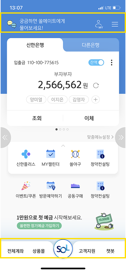
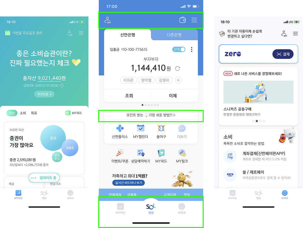
Work Process Redesign
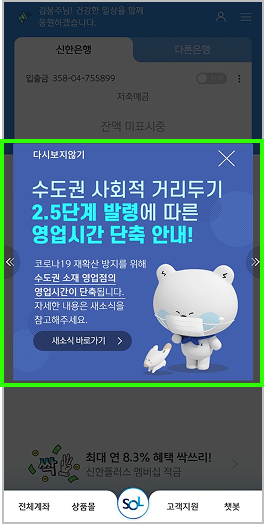
금융권에서는 흔한 일이었습니다. 그러나 이 워크플로는 협업을 느리게 하고, 디자인 일관성을 깨뜨리고, 개발 핸드오프에서 불필요한 커뮤니케이션 비용을 만들었습니다. Common in the financial sector. But this workflow slowed collaboration, broke design consistency, and created unnecessary communication overhead at dev handoff.
Before
기존 워크플로 Legacy workflow
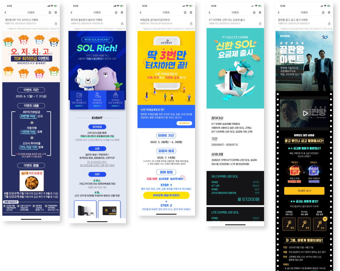
화면 설계는 파워포인트, 시각 디자인은 포토샵, 공유는 이메일. 각 단계에서 파일이 복사되고 버전이 갈라졌습니다. "최종_최종_진짜최종.psd"가 실재하는 환경이었습니다. 핸드오프 시 개발자는 픽셀을 직접 눈으로 측정해야 했습니다. Wireframes in PowerPoint, visual design in Photoshop, sharing via email. Files got copied and versioned at every step. "Final_Final_RealFinal.psd" was a real thing. At handoff, developers had to measure pixels by eye.
After
전환 후 워크플로 Post-transition workflow
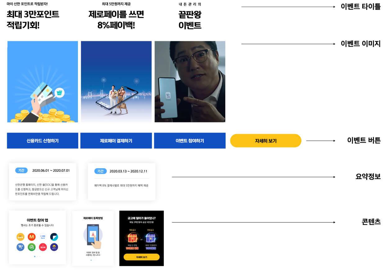
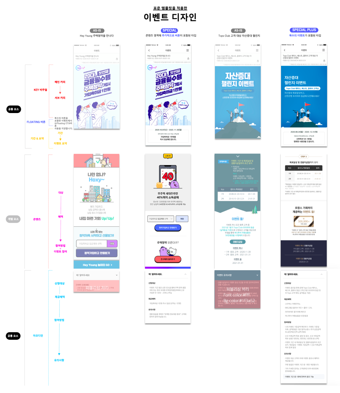
IA부터 최종 시안까지 Figma 한 곳에서 관리. 컴포넌트 라이브러리로 일관성 확보. Zeplin 연동으로 핸드오프 커뮤니케이션 비용 절감. 무엇보다 "어떤 파일이 최신인지" 묻는 시간이 사라졌습니다. IA through final design managed in Figma. Component library for consistency. Zeplin integration to reduce handoff communication. Most importantly: no more time spent asking "which file is the latest?"
팀 전체 Figma 전환 완료 Full team Figma migration complete
Chapter 02
메일, 쪽지, 전화, 팝업 — 고객에게 닿는 모든 접점에서 이벤트는 다른 방식으로 전달되고 있었습니다. Email, in-app messages, push, popups — events reached customers differently at every single touchpoint.
Event Templates
일관된 아이덴티티도 없고, 기간·경품·참여 조건이 매번 다른 위치에 표시되었습니다. 사용자는 같은 은행의 이벤트임에도 매번 새로 학습해야 했습니다. No consistent identity. Period, prizes, and participation conditions appeared in different positions every time. Users had to re-learn each event even though it was the same bank.
Chapter 03
SOL 안의 다양한 상품과 서비스를 사용자에게 더 스마트하게 제안하기. 단순히 노출을 늘리는 것이 아니라, 맥락에 맞는 제안을 설계하는 것이었습니다. Smarter proposals of SOL's diverse products and services. Not simply increasing exposure — but designing contextually relevant offers.
Smarter Offer · Direction
오퍼의 품질을 높이기 위해 사용성, 인지성, 시각 위계, 일관성 네 가지 축을 설정했습니다. 각 축은 독립적이지만, 동시에 충족될 때 시너지를 냅니다. To improve offer quality, we established four axes: usability, cognition, visual hierarchy, and consistency. Each axis is independent, but creates synergy when all are met simultaneously.
Usability
사용성을 높이기 위해 제한된 화면 영역 안에서 핵심 정보만 노출하고, 나머지는 사용자의 인터랙션 이후에 드러나도록 설계했습니다. To improve usability, only essential information is shown within limited screen space — the rest reveals itself after user interaction.
Cognition
인지성을 높이기 위해 과중한 정보를 제거하고, 사용자가 즉각적으로 이해할 수 있는 단계별 정보 구조를 적용했습니다. To improve cognition, we removed information overload and applied a stepped information structure that users can understand immediately.
Visual Hierarchy
시각적 위계 형성을 표준화하여 정보의 중요도가 눈에 보이도록 했습니다. 크기, 색상, 여백이 일관된 규칙을 따릅니다. Standardized visual hierarchy formation so information importance is visually legible. Size, color, and spacing follow consistent rules.
Consistency
제각기 다른 색상과 구성요소를 일관성 있는 패턴으로 통합했습니다. 사용자가 다른 탭으로 이동해도 동일한 언어를 경험합니다. Different colors and components were unified into consistent patterns. Users encounter the same design language regardless of which tab they're in.
화면별 오퍼 적용 Offer application per screen
Copywriting Guidance
어려운 금융 언어는 사용자를 멀리합니다. 오퍼 카피의 기준을 명문화해 디자이너와 마케터가 같은 언어로 일할 수 있게 했습니다. Complex financial language pushes users away. Codifying copy standards let designers and marketers work in the same language.
짧은 카피 안에서도 고객이 의도를 알 수 있어야 합니다. 모호한 표현, 중의적 문구는 피합니다. Even in short copy, the intent must be clear. Avoid ambiguous or double-meaning phrases.
어려운 금융 용어를 지양하고 고객이 이미 알고 있는 단어를 씁니다. 설명이 필요한 단어는 카피에 들어올 수 없습니다. Avoid complex financial terms. Use words customers already know. If a word needs explaining, it doesn't belong in copy.
핵심만을 복잡하지 않게 전달하여 이목을 집중시킵니다. 하나의 카피에 두 가지 메시지는 없습니다. Deliver only the essential, without complexity. One copy, one message. Never two.
동일한 톤과 스타일, 용어를 사용하여 브랜드 신뢰감을 형성합니다. 채널이 달라도 같은 목소리여야 합니다. Consistent tone, style, and terminology builds brand trust. The same voice, regardless of which channel.
Smarter Offer · How to Hook
상품 오퍼에서 사용자의 관심을 끄는 방식은 여러 가지입니다. 어떤 훅을 쓸지는 상황과 타겟에 따라 달라집니다. 7가지 훅 패턴을 정의하고 각 화면 유형에 적용 기준을 세웠습니다. There are many ways to capture user attention in product offers. Which hook to use depends on context and target. We defined 7 hook patterns and established criteria for applying each to screen types.
Chapter 04
뱅킹 위주로 서비스되다 보니 MY자산, 상품+로의 진입이 묻혀 있었습니다. 복잡해진 상단을 정리하고 핵심 진입점을 드러내는 작업이었습니다. Because banking was the primary focus, MY assets and Product+ entry points were buried. The work was to declutter the complicated top area and surface the key entry points.
SOL Home Panel
Chapter 05
뱅킹 위주의 구조에서 벗어나, 사용자가 자신의 전체 금융 상황을 한눈에 조망하고 행동으로 이어질 수 있는 공간을 설계했습니다. Moving beyond the banking-only structure, we designed a space where users can view their entire financial picture at a glance and take action from there.
쏠지갑 · SOL Wallet
뱅킹(계좌·이체), 자산(예적금·투자·대출 한눈에), 상품+(맞춤 추천·주간 베스트) — 각 탭이 독립적으로 기능하면서도 사용자의 금융 여정을 하나로 이어줍니다. Banking (accounts & transfers), Assets (deposits, investments, loans at a glance), Products+ (personalized recommendations, weekly best) — each tab functions independently while connecting the user's full financial journey.
계좌 카드 + 맞춤 메뉴
쏠지갑 목표 연동
Account cards + Custom menu
SOL Goal integration
한눈에 · 자산 · 소비 · 목표
17개 카테고리 통합 조회
Overview · Assets · Spending · Goals
17 categories unified
맞춤 추천 · 관심 추천 · 주간 Best
연령별 개인화 오퍼
Personalized · Interest-based · Weekly Best
Age-based personalized offers
400개가 넘는 메뉴들 중 Among 400+ menus
SOL의 방향은 수퍼플랫폼입니다. 하지만 플랫폼이 아무리 넓어도 사용자가 길을 잃으면 의미가 없습니다. 덜 보여주되 더 잘 안내하는 것이 이 모든 작업을 관통하는 원칙이었습니다. SOL's direction is super-platform. But no matter how wide the platform, it's meaningless if users get lost. Show less, guide better — that was the principle threading through all of this work.