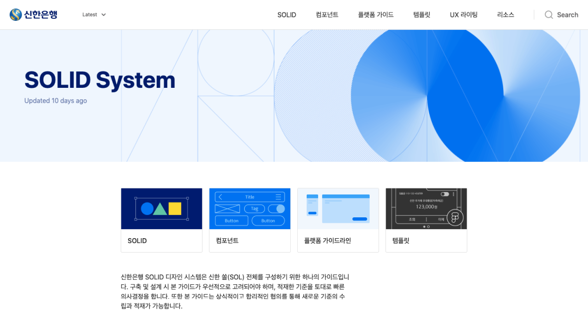
Overview

왜 신한은행에 디자인 시스템이 필요했는가 Why Shinhan Bank needed a design system

"같은 은행 앱인데 화면마다 버튼이 다르게 생겼어요. 뭘 눌러야 할지 모르겠더라고요."

"It's the same bank app, but the buttons look different on every screen. I couldn't tell what to press."

사용자 인터뷰 중, 신한 SOL 뱅킹 앱 From a user interview, Shinhan SOL Banking App

신한은행은 국내 최대 금융그룹 중 하나입니다. 그만큼 디지털 채널의 범위도 넓었습니다. 개인뱅킹, 기업뱅킹, 증권, 보험, 신용카드 — 각 제품팀은 오랜 기간 독립적으로 운영되며 서로 다른 컴포넌트 라이브러리를 쌓아왔습니다. Shinhan Bank is one of Korea's largest financial groups — and its digital footprint matched that scale. Retail banking, corporate banking, securities, insurance, credit cards: each product team had operated independently for years, accumulating their own component libraries along the way.

결과는 예측 가능했습니다. 같은 은행이지만 채널마다 다른 UI, 같은 기능인데 다른 패턴, 새 기능을 만들 때마다 처음부터 다시 그리는 비효율. UX 셀장으로 부임하며 맡은 첫 번째 과제는 이 파편화를 해결할 기준을 만드는 것이었습니다. The result was predictable. Same bank, different UI across channels. Same features, different patterns. Every new feature built from scratch. My first task as UX Cell Lead was to build a standard that would resolve this fragmentation.

My Contribution

전략부터 운영까지 직접 소유. 디자인 시스템의 필요성 설득(임원 포함), TF 조직 구성, 컴포넌트 우선순위 결정, 토큰 체계 설계, 채택률 관리, 거버넌스 프로세스 수립까지 전 과정을 리드했습니다. Full ownership from strategy to operations. I drove the case for investment (up to executive level), organized the task force, prioritized components, designed the token system, managed adoption rates, and established the governance process.

Role UX 셀장 (팀장급) / 디자인시스템 Lead UX Cell Lead / Design System Lead
Team UX 디자이너 5명, 프론트엔드 개발자 3명, PM 1명 5 UX designers, 3 frontend developers, 1 PM
Scope SOL 뱅킹 앱 · 기업뱅킹 · 웹 채널 · 내부 도구 SOL Banking App · Corporate Banking · Web Channels · Internal Tools
Skills
Design System Strategy Component Architecture Design Tokens Governance Design Stakeholder Management Team Leadership Figma Zeroheight
Period 2019 – 2022 (약 3년)

Key Achievement

숫자로 본 임팩트 Impact by the numbers

240+
컴포넌트 Components
3년간 단계적으로 구축한 컴포넌트 수. Atom 82개, Molecule 94개, Organism 64개 — 금융 특화 패턴 포함. Components built over 3 years. 82 Atoms, 94 Molecules, 64 Organisms — including finance-specific patterns.
7
채택 제품팀 Adopting product teams
개인뱅킹부터 기업금융까지, 출시 18개월 만에 7개 제품팀이 시스템을 공식 채택했습니다. From retail to corporate banking — 7 product teams officially adopted the system within 18 months of launch.
40%
디자인 리드타임 단축 Design lead time reduction
신규 화면 설계 시 컴포넌트 조합만으로 해결되는 비율 증가 → 설계-개발 핸드오프 시간 약 40% 단축. Higher ratio of new screens solvable via component composition → ~40% reduction in design-to-handoff time.

The Problem

파편화의 세 가지 증상 Three symptoms of fragmentation

3주간의 현황 감사(audit)를 통해 문제의 구조를 파악했습니다. 단순한 비일관성이 아니라, 조직 구조가 만들어낸 구조적 문제였습니다. A 3-week audit surfaced the structure of the problem. This wasn't simple inconsistency — it was a structural problem created by org structure.

Problem 01

6개 팀, 6개의 버튼 6 teams, 6 button styles

주요 UI 채널 6개를 감사한 결과, Primary Button만 11가지 변형이 존재했습니다. 색상, radius, 높이, 폰트 사이즈 모두 달랐습니다. 사용자는 같은 은행의 서비스임을 인식하기 어려웠습니다. Auditing 6 major UI channels revealed 11 variations of the Primary Button alone. Color, radius, height, and font size all differed. Users had no way to recognize they were in the same bank's ecosystem.

Problem 02

새 화면을 만들 때마다 처음부터 Starting from zero with every new screen

재사용 가능한 컴포넌트가 없었기 때문에 디자이너는 신규 화면마다 동일한 요소를 반복 제작했습니다. 평균 신규 화면 1개 설계에 소요되는 시간의 35% 이상이 기존에 만들어졌어야 할 요소를 다시 그리는 데 쓰였습니다. Without reusable components, designers recreated identical elements for every new screen. Over 35% of time spent designing a new screen went to redrawing elements that should have already existed.

Problem 03

디자인-개발 간 번역 비용 Translation cost between design and development

공통 용어가 없으니 핸드오프는 매번 협상이었습니다. 디자이너가 "Primary Blue"라고 부르는 색상을 개발자는 코드에서 7개의 다른 hex 값으로 구현하고 있었습니다. 이 불일치는 QA에서 발견되었고, 수정 비용으로 이어졌습니다. With no shared vocabulary, every handoff was a negotiation. What designers called "Primary Blue" was implemented in code as 7 different hex values. Discrepancies surfaced in QA, creating rework costs.

UI Audit — 채널별 버튼 변형 비교 UI Audit — 채널별 컴포넌트 현황

Leadership Decisions

세 가지 핵심 결정 Three critical decisions

Decision 01

별도 TF로 분리, 단독 오너십 부여 Separate TF with sole ownership

조직 구조 결정 Org structure decision

초기 제안은 각 제품팀에서 디자이너를 파트타임으로 차출해 운영하는 방식이었습니다. 저는 이것이 실패할 것임을 알았습니다. 부업처럼 운영되는 디자인 시스템은 항상 제품 일정에 밀립니다. The initial proposal was to pull designers part-time from each product team. I knew this would fail. A design system run as a side job always loses to product deadlines.

임원을 설득해 전담 TF를 구성했습니다. 디자이너 5명, 프론트 개발자 3명, PM 1명 — 시스템만 책임지는 팀. 이 결정이 이후 3년간 시스템이 살아남은 가장 큰 이유입니다. I persuaded leadership to form a dedicated TF. 5 designers, 3 frontend developers, 1 PM — a team accountable only to the system. This decision is the single biggest reason the system survived three years.

전담 TF 조직 승인 — 2019 Q3 Dedicated TF approved — 2019 Q3

Decision 02

강제 채택이 아닌 "먼저 증명하기" 전략 "Prove it first" strategy over mandated adoption

채택 전략 결정 Adoption strategy decision

탑다운으로 시스템 채택을 강제할 수 있는 권한이 있었지만 사용하지 않았습니다. 신뢰 없이 강제된 표준은 형식적인 준수만 낳습니다. 대신, 가장 영향력 있는 팀 두 곳(SOL 뱅킹, 기업뱅킹)에 집중해 시스템이 실제로 시간을 아끼고 품질을 높인다는 것을 먼저 증명했습니다. I had the authority to mandate adoption top-down but chose not to. Standards enforced without trust produce only surface compliance. Instead, I focused on two high-visibility teams — SOL Banking and Corporate Banking — and proved the system actually saved time and improved quality before asking anyone else to adopt it.

6개월 후, 나머지 팀들이 먼저 채택을 요청했습니다. Six months later, the other teams asked to adopt it themselves.

자발적 채택 요청 — 출시 6개월 후 Voluntary adoption requests — 6 months post-launch

Decision 03

기여 프로세스와 거버넌스를 처음부터 설계 Contribution process and governance designed from day one

거버넌스 결정 Governance decision

컴포넌트가 늘어나면서 "누가 어떤 기준으로 변경하는가"의 문제가 생겼습니다. 명확한 거버넌스 없이 운영되는 시스템은 결국 개인의 취향으로 산화됩니다. RFC(Request for Comment) 기반 제안 프로세스와 Review Committee를 만들어 변경의 책임 소재와 기준을 명문화했습니다. As the component library grew, the question of "who changes what, and by what criteria" emerged. A system operated without clear governance eventually devolves into individual preference. I introduced an RFC-based proposal process and a Review Committee to formalize accountability and criteria for changes.

RFC v1.0 운영 시작 — 2020 Q2 RFC v1.0 process launched — 2020 Q2

Governance Model

누가 무엇을 결정하는가 Who decides what

시스템은 기술 산출물인 동시에 조직 산출물입니다. 거버넌스 모델이 없으면 기술이 아무리 훌륭해도 시스템은 붕괴합니다. A design system is a technical artifact and an organizational artifact. Without a governance model, even excellent technology will collapse.

역할 구성 책임
DS Core Team DS Core Team

전담 TF (디자이너 5, FE 3, PM 1) Dedicated TF (5 designers, 3 FE, 1 PM)

컴포넌트 설계 및 유지, 문서화, 버전 릴리즈, RFC 검토 Component design and maintenance, documentation, version releases, RFC review

Review Committee Review Committee

제품팀 대표 디자이너 (팀당 1인) + DS Lead Representative designer from each product team + DS Lead

신규 컴포넌트 제안 승인/기각, 기존 컴포넌트 변경 결정, 분기별 정기 회의 Approve/reject new component proposals, decide on existing component changes, quarterly meetings

Product Teams Product Teams

채택 팀의 디자이너 · 개발자 Designers and developers from adopting teams

RFC 제출 (신규 필요 컴포넌트 제안), 버그 리포트, 채택률 피드백 Submit RFCs (propose new components needed), bug reports, adoption feedback

Build Process

3단계로 쌓은 시스템 System built in three layers

Layer 01Foundation

디자인 토큰 — 색상, 타이포그래피, 스페이싱 Design tokens — color, typography, spacing

컴포넌트보다 먼저 만든 것은 토큰 체계입니다. 디자이너와 개발자가 같은 이름으로 같은 값을 참조할 수 있어야 "Primary Blue"가 코드에서 7개의 hex 값으로 쪼개지는 일이 멈춥니다. Figma Variables와 CSS Custom Properties를 1:1로 매핑해 핸드오프에서의 번역 오류를 구조적으로 제거했습니다. Before components, we built the token system. Designers and developers needed to reference the same values by the same names — that's how you stop "Primary Blue" from becoming 7 different hex values in code. We mapped Figma Variables to CSS Custom Properties 1:1, structurally eliminating translation errors at handoff.

Color Tokens Typography Scale Spacing System Elevation Figma Variables

Layer 02Components

컴포넌트 라이브러리 — Atom → Molecule → Organism Component library — Atom → Molecule → Organism

Atomic Design 방법론을 기반으로 구조를 잡았습니다. 단, 금융 서비스의 특성상 표준 패턴만으로는 해결되지 않는 케이스가 많아, 금융 특화 패턴(계좌 정보 카드, 거래 내역 리스트, 보안 입력 필드 등)을 별도 카테고리로 분류했습니다. 컴포넌트 우선순위는 채택 팀의 실제 사용 빈도 데이터를 기반으로 결정했습니다. We structured the library on Atomic Design, but financial services have many cases that standard patterns can't solve. Finance-specific patterns (account info cards, transaction history lists, secure input fields) were classified as a separate category. Component priority was determined by actual usage frequency data from adopting teams.

240+ Components Atomic Design Finance-specific Patterns Dark/Light Mode Accessibility (WCAG 2.1)

Layer 03Documentation

문서화 — "왜 이렇게 만들었는가"를 남기는 것 Documentation — recording "why we built it this way"

Zeroheight를 활용해 각 컴포넌트의 사용 가이드라인, 사용하면 안 되는 케이스, 접근성 요구사항을 문서화했습니다. 특히 "언제 이 컴포넌트를 쓰지 말아야 하는가"를 명시한 것이 팀에서 가장 유용하다는 피드백을 받았습니다. 의사결정 배경을 기록하는 ADR(Architecture Decision Record) 방식을 UX 문서에 도입했습니다. We used Zeroheight to document usage guidelines, anti-patterns, and accessibility requirements for each component. Explicitly stating "when NOT to use this component" got the most positive feedback from teams. We also introduced ADR-style documentation (Architecture Decision Records) to record the reasoning behind design decisions.

Zeroheight Usage Guidelines Anti-patterns Decision Records Accessibility Checklist

Token Architecture (예시)

--color-primary-500 #0046BE
--color-primary-700 #003399
--color-primary-50 #E8F0FB
--color-warning-500 #FF6B00
--text-primary #111111
--text-secondary #555555
--bg-subtle #F5F5F5
--border-default #E2E2E2
Figma 컴포넌트 라이브러리 — 스타일 가이드 Figma 컴포넌트 라이브러리 — 컴포넌트 구조

Adoption Strategy

채택률을 높인 세 가지 전술 Three tactics that drove adoption

Tactic 01

파일럿 팀 성공 사례를 공식화 Formalizing pilot team success stories

SOL 뱅킹팀이 디자인 시스템을 사용해 신규 기능을 설계했을 때의 시간 단축 사례를 내부 발표 자료로 만들었습니다. "30%의 시간을 아꼈다"는 데이터가 다른 팀들의 채택 의지를 높이는 데 가장 효과적이었습니다. 이야기는 전파되고, 스펙 문서는 읽히지 않습니다. When the SOL Banking team used the design system to ship a new feature faster, I turned that into an internal case presentation. "We saved 30% of our time" did more to drive adoption than any specification document. Stories spread; spec docs don't get read.

내부 케이스 발표 → 3개팀 추가 채택 요청 Internal case presentation → 3 additional teams requested adoption

Tactic 02

DS 온보딩 세션 정례화 Recurring DS onboarding sessions

새로운 팀이 합류할 때마다, 그리고 신입 디자이너/개발자가 입사할 때마다 온보딩 세션을 직접 진행했습니다. 문서를 읽으라고 공유하는 것은 효과가 없습니다. 실제 화면을 함께 시스템으로 재구성해보는 실습이 훨씬 효과적이었습니다. Every time a new team joined or a new designer/developer was hired, I ran onboarding sessions personally. Sharing a doc and saying "read this" doesn't work. The most effective format was a live exercise: reconstructing an actual screen using the system together.

월 1회 온보딩 세션 — 참가자 누적 80+명 Monthly onboarding sessions — 80+ cumulative participants

Tactic 03

DS 슬랙 채널 운영 — "묻고 바로 받는" 구조 DS Slack channel — "ask and get answers fast"

문서가 아무리 잘 만들어져도 실제 업무에서 막히는 케이스는 항상 생깁니다. DS 전용 슬랙 채널을 만들고 TF가 24시간 이내 응답하는 것을 SLA로 정했습니다. 빠른 응답이 신뢰를 만들고, 신뢰가 채택을 만든다는 것을 이 경험을 통해 확인했습니다. No matter how good the documentation, edge cases always emerge in practice. We created a dedicated DS Slack channel and set a 24-hour response SLA for the TF. Fast responses build trust, and trust builds adoption — this experience confirmed it.

평균 응답 4.2시간 / 월 350+ 질문 처리 Average response 4.2h / 350+ questions handled monthly

Results

3년 후, 무엇이 달라졌는가 Three years later — what changed

7
채택 제품팀 Product teams adopted
SOL 뱅킹, 기업뱅킹, 증권, 신용카드, 대출, 외환, 내부 어드민 포함 Including SOL Banking, Corporate, Securities, Credit Card, Loan, FX, Internal Admin
240+
컴포넌트 Components
v1.0(82개)에서 시작해 v3.2 기준 240+개로 성장 Grew from 82 in v1.0 to 240+ by v3.2
40%
설계 시간 단축 Design time reduction
채택 팀 평균 기준. 신규 화면 설계 기준 측정. Average across adopting teams, measured against new screen design.

Leadership Outcome

"디자인이 은행 전체의 개발 속도를 높였다"는 것을 처음으로 증명한 사례 The first time design was demonstrably credited with accelerating bank-wide development velocity

이 프로젝트 이전까지 신한은행 내에서 UX는 "보기 좋게 만드는 팀"으로 인식되었습니다. 디자인 시스템이 개발 속도 향상과 직접 연결된다는 데이터를 가져가면서, UX팀이 제품 개발의 핵심 인프라를 소유하는 팀으로 포지션이 바뀌었습니다. Before this project, UX at Shinhan Bank was perceived as "the team that makes things look nice." By bringing data that connected design system adoption directly to development velocity, the UX team repositioned itself as the team that owns core product development infrastructure.

이 포지션 변화가 이후 UX팀 인원 확충 및 예산 증가의 직접적 근거가 되었습니다. This repositioning became the direct basis for subsequent headcount expansion and budget increase for the UX team.

Reflection

지금 다시 한다면 다르게 할 것들 What I'd do differently

디자인 시스템의 가장 큰 위험은 팀이 시스템을 만드는 것 자체에 집중하는 것입니다. 시스템은 목적이 아니라 수단입니다. The biggest risk in design system work is the team becoming focused on building the system itself. The system is a means, not an end.

초기 1년 동안 컴포넌트 완성도에 집착한 나머지, 실제 사용자(제품팀 디자이너)의 피드백 루프가 느렸습니다. "완벽한 컴포넌트"보다 "80% 완성도로 빠르게 배포하고 팀의 피드백을 받아 개선하는" 방식이 장기적으로 더 나은 결과를 만들었습니다. In the first year, I was too focused on component polish, which slowed the feedback loop from our actual users — the product team designers. "Deploy at 80% and improve from team feedback" produced better long-term outcomes than "ship the perfect component."

What didn't go well

Dark Mode 지원을 뒤늦게 고려해, 전체 토큰 체계를 v2.0에서 상당 부분 재설계해야 했습니다. Semantic Token 레이어를 처음부터 설계했더라면 피할 수 있었던 기술 부채입니다. Dark Mode support was considered too late, requiring significant rework of the entire token system in v2.0. This was avoidable technical debt — if we'd designed the semantic token layer from the start, we wouldn't have had to redo it.

잘한 것 What worked 전담 TF 구성, "증명 먼저" 채택 전략, 거버넌스 초기 설계 Dedicated TF, "prove first" adoption strategy, early governance design
다음엔 Next time Semantic Token 레이어 Day 1 설계, 더 빠른 베타 배포 및 피드백 루프 Design semantic token layer from Day 1, faster beta releases with tighter feedback loops
배운 것 Key learning 디자인 시스템 리드는 UX 역할인 동시에 내부 제품 PM 역할입니다. 기술보다 사람과 조직을 다루는 능력이 결과를 결정합니다. Design system lead is simultaneously a UX role and an internal product PM role. Managing people and organization matters more than technical ability.