Class101 · 2022 – 2024

구독 전환부터 커머스까지,
제품 성장의 두 챕터
From subscription pivot to commerce,
two chapters of product growth

전사 BM 전환 프로젝트에서 S&D 도메인을 이끌고, 이후 Commerce 도메인으로 이동해 그룹 구독 설계, 개별판매 전환율 개선, 해지 방어 실험을 주도했습니다.

Led the S&D domain during the company-wide subscription pivot, then moved to Commerce to design the group plan, improve individual sales conversion, and run churn defense experiments.

Role Senior Product Designer
Period Dec 2022 – Mar 2024
Domain S&D → Commerce
Team PO 1, 개발자 4, 디자이너 1 1 PO, 4 Devs, 1 Designer

Overview

구독 BM 전환 → 커머스 수익 최적화

Subscription pivot → Commerce revenue optimization

COVID-19 특수가 꺼지면서 클래스101은 구조적인 성장 위기에 직면했습니다. 회사는 단건 판매 모델에서 월 ₩19,000 구독으로 전사 BM을 전환했고, 8개월의 재구축 끝에 3개국 동시 출시를 완료했습니다. 이후 커머스 도메인으로 이동해 구독자 수 정체 돌파, 개별판매 생태계 회복, 해지율 감소라는 세 가지 과제를 실험 기반으로 풀었습니다.

As COVID tailwinds faded, Class101 faced a structural growth crisis. The company pivoted from individual class sales to a ₩19,000/month subscription model and relaunched across 3 markets after 8 months of rebuilding. I then moved to the Commerce domain to tackle three problems: breaking the subscriber plateau, reviving the individual sales ecosystem, and reducing churn through experimentation.

8 mo
전사 리빌드
Full rebuild
레거시 청산 후 3개국 (한/영/일) 동시 출시
Launched simultaneously across 3 markets (KO/EN/JA)
160K
구독자 — 출시 시점
Subscribers at launch
초기 구독자 수 — 이후 정체 구간 진입
Initial subscriber count — later plateaued at 140K
96%
첫 달 유지율
First-month retention
구독 전환 직후 초기 리텐션
Retention immediately after subscription launch

Chapter 01

구독 전환 · S&D

Subscription Launch · S&D

다크테마 도입과 개인화 추천 섹션으로 콘텐츠 몰입도 및 전환율 개선. 8개월 리빌드 중 디자인 시스템과 Search & Discovery 도메인 단독 담당.

Improved content immersion and conversion through dark theme and personalized recommendations. Sole IC on design system and S&D during the 8-month rebuild.

Chapter 02

그룹 구독

Group Subscription

정체된 구독자 수를 돌파하기 위한 신규 플랜 0→1 설계. 멀티 디바이스 데이터와 이탈 설문을 연결해 그룹 구독 가설을 직접 도출.

Designed a 0→1 group plan to break the subscriber plateau. Independently derived the hypothesis by connecting multi-device usage data with exit survey signals.

Chapter 03

개별판매 2.0

Individual Sales 2.0

구독 전환 이후 위축된 PDP 전환율 회복. 3종 A/B 실험으로 "가격 노출 우선 UI"가 유효함을 확인하고 미리보기 기능 재도입.

Recovered PDP conversion shrunk after the subscription pivot. Confirmed "price-first UI" effectiveness through 3-variant A/B test and revived the preview feature.

Chapter 04

해지 방어

Churn Defense

수동적 해지 플로우를 분석하고 어피니티 다이어그래밍 워크샵으로 이탈 사유 6개 클러스터 분류. 두 가지 실험으로 해지율 최대 2.9% 감소.

Analyzed a passive cancellation flow, ran affinity diagramming workshops to classify 6 churn clusters. Two experiments reduced churn by up to 2.9%.

Chapter 01 of 04

전사 구독 전환 — S&D 도메인 리드

Company-wide subscription pivot — S&D domain lead

COVID-19 이후 성장 둔화와 레거시 기술부채를 한 번에 해결하기 위한 전사적 BM 전환. 8개월 리빌드 동안 디자인 시스템과 Search & Discovery 도메인을 단독 담당.

A company-wide pivot to address post-COVID slowdown and accumulated tech debt simultaneously. Sole IC on design system and S&D domain across the 8-month rebuild.

Design System Dark Theme Personalization

Context & My Work

디자인 시스템 · Search & Discovery

Design System · Search & Discovery

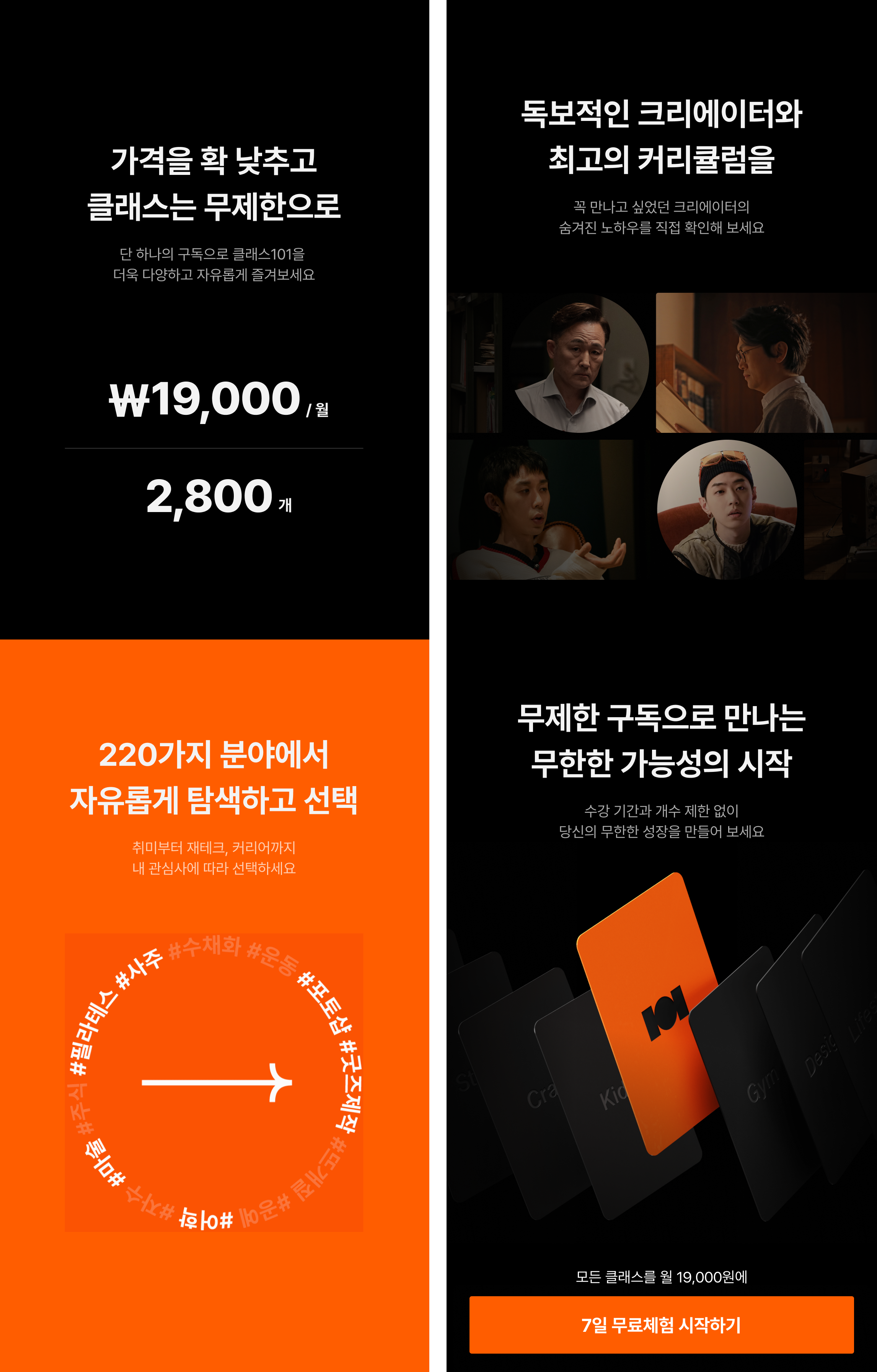
단건 구매 → 구독 전환 이후 "무엇을 들어야 할지 모르겠다"는 이탈을 막는 것이 S&D 도메인의 핵심 과제였습니다.

After the individual purchase → subscription shift, the core S&D challenge was reducing dropoff from users who said "I don't know what to watch."

Design System

다크테마 도입 및 색상 토큰 정의

Dark theme & color token system

브랜드팀 협업

Cross-team with Brand

콘텐츠 몰입감 강화를 위해 다크테마를 제안하고 이해관계자 설득을 거쳐 추진했습니다. 브랜드 디자인팀과 협업해 다크 환경에 맞는 브랜드 어셋을 제작하고, 라이트/다크 색상 토큰 시스템을 정의했습니다. 전체 컴포넌트의 테마 대응 기준이 됐습니다.

Proposed dark theme for deeper content immersion and drove it through stakeholder alignment. Collaborated with brand design to produce dark-environment assets, then defined the light/dark color token system — which became the theming standard for all components.

S&D Domain

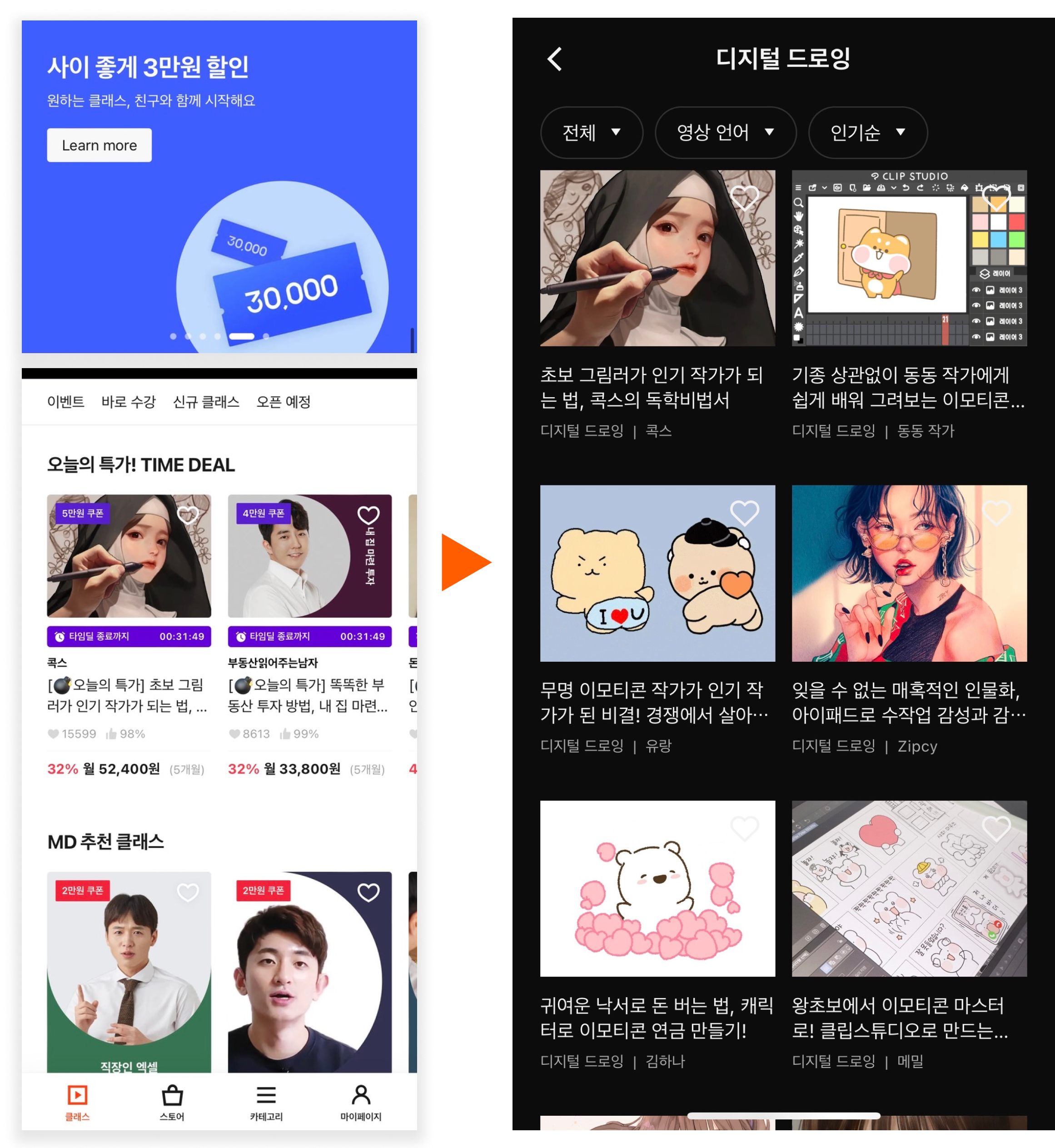
4,000개 클래스 탐색 경험 재설계

Discovery UX for 4,000+ classes

단독 IC

Sole IC

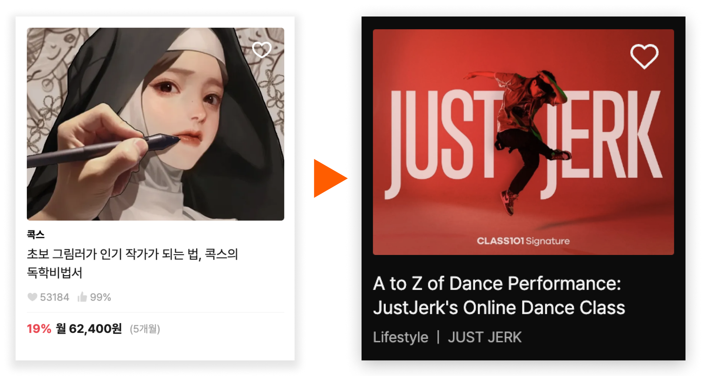
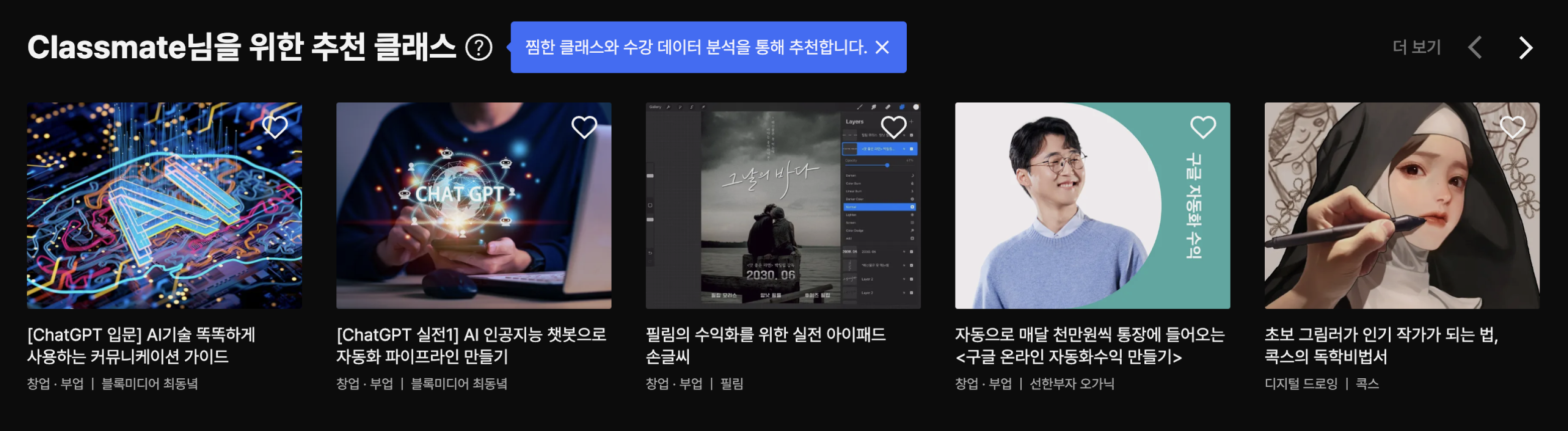
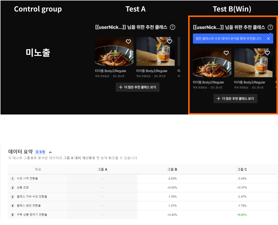
구독 전환 후 콘텐츠 과잉으로 인한 이탈을 줄이기 위해 사용자 관심 기반 개인화 추천 섹션을 추가했습니다. 프로덕트 카드 내 정보를 단순화해 빠른 파악이 가능하도록 했고, IA를 직관적으로 재설계했습니다.

Added interest-based personalized recommendation sections to reduce dropoff from content overload after the subscription shift. Simplified product card information for faster scanning and redesigned IA for intuitive browsing.

개인화 추천 섹션 도입 후 구독 전환율 +9.93% 상승 Personalized recommendation sections drove a +9.93% lift in subscription conversion
다크테마 홈 화면 · S&D 개인화 추천 섹션 UI

Chapter 02 of 04

그룹 구독 — 정체된 구독자 수를 돌파한 신규 플랜 0→1 설계

Group Subscription — Designing a 0→1 plan that broke the subscriber plateau

2년간의 가격 실험 데이터와 두 개의 독립된 행동 신호를 연결해 그룹 구독 가설을 직접 도출하고, 플랜 구조 설계부터 진입 플로우까지 전체를 담당했습니다.

Connected two years of pricing experiment data with two independent behavioral signals to independently derive the group subscription hypothesis — then owned the full scope from plan structure to entry flow design.

0→1 Product Design Subscription Design Behavioral Analytics

Background — 2년간의 가격 실험

어떤 가격 실험도 정체를 해결하지 못했다

No pricing experiment solved the plateau

구독 전환 이후의 구독자 정체를 풀기 위해 2년간 여러 가격 구조를 실험했지만, 일시적 변화만 있을 뿐 근본 원인에 닿지 못했습니다. 답은 가격 자체가 아닌 다른 곳에 있었습니다.

Two years of pricing experiments trying to break the subscriber plateau yielded only short-term shifts. The answer wasn't in price itself.

2020

구독 BM 검토 시작. 크리에이터 수익 안정화와 사용자 유지율 개선을 위해 구독 전환 논의 시작.

Subscription model exploration begins. Discussions start around creator revenue stability and user retention improvement.

2021

연간 구독 베타 출시 및 가격 실험. 다양한 가격대와 프로모션을 A/B 테스트. 월 플랜 미제공 정책 확정 — 연간 단일 플랜으로 운영.

Annual subscription beta and pricing experiments. A/B tested various price points and promotions. Confirmed no monthly option — annual-only plan.

2022

전사 구독 BM 전환 완료. 대다수 클래스가 구독 번들로 이동. 160K 구독자·96% 유지율로 출시. 이후 구독자 수 140K대 정체 진입.

Full subscription pivot complete. Majority of classes moved to subscription bundle. Launched with 160K subscribers and 96% retention. Subscriber count then plateaued around 140K.

2023

Commerce 도메인으로 이동, 그룹 구독 기획 착수. 가격 실험 한계 인식 후 행동 데이터와 이탈 리서치를 병행 분석해 공유 니즈를 정량화하고 그룹 플랜 설계 진입.

Moved to Commerce domain, group subscription planning begins. Recognized limits of pricing experiments, ran behavioral analytics and cancellation research in parallel to quantify sharing demand.

01 — Problem

구독은 늘지 않고, 유저는 "같이 쓰고 싶다"고 말한다

Subscriptions stagnate while users say "I want to share this"

구독자 수 정체

Subscriber plateau

연간 구독 전환 이후 구독자 수가 140K 내외에서 멈췄습니다. 신규 유입 대비 이탈이 균형을 이루는 구간에 진입했고, 단순 가격 인하로는 이 정체를 깰 수 없었습니다.

After the annual subscription pivot, subscriber count stagnated around 140K. Acquisition and churn reached equilibrium. Simple price reduction couldn't break the plateau.

연간 결제의 심리적 장벽

Psychological barrier of annual commitment

월 플랜이 없는 환경에서 연간 구독 결제는 큰 심리적 장벽으로 작용했습니다. 특히 신규 유저에게 "1년치 콘텐츠를 다 소비할 수 있을지"에 대한 불확실성이 높았습니다.

Without a monthly option, the annual subscription was a significant psychological barrier. New users especially faced high uncertainty: "Will I consume enough to justify a year's payment?"

핵심 신호 — 직접 발견

Key signal — independently identified

반기 접속 로그 분석 중 구독자의 23%가 3개 이상의 기기에서 접속 중임을 발견. 이탈 설문에서는 42%가 "가족·지인과 함께 쓰고 싶어서"를 이탈 이유로 선택. 공유 니즈는 있지만 구조가 없었다.

While analyzing 6-month access logs, found that 23% of subscribers used 3+ devices. Exit surveys showed 42% cited "want to share with family/friends" as their cancellation reason. The demand existed — the structure didn't.

23%
멀티 디바이스 이용자
Multi-device users
RudderStack 데이터 — 동일 계정을 3개 이상 기기에서 접속. 최대 16개 기기 사례 확인
RudderStack data — same account accessed from 3+ devices. Extreme case: 16 devices per user
42%
이탈 설문 공유 니즈
Exit survey: sharing intent
"가족/지인과 함께 이용하고 싶다"를 해지 이유로 선택한 비율
Cited "want to use with family/friends" as cancellation reason
0
구조화된 공유 방법
Structured sharing options
니즈는 확인됐지만 플랫폼 내 공유 구독 경로 전무
Demand confirmed, but zero sharing subscription paths on the platform

02 — Hypothesis

"못 다 쓴 콘텐츠"를 "공유 할인"으로 재프레이밍하면?

What if "unused content" becomes a "shared discount"?

Hypothesis

1년 안에 다 소비하지 못해 "손해"로 인식되는 콘텐츠를, 공유 구독의 할인 혜택으로 재프레이밍하면 더 많은 유저가 연간 구독으로 전환할 것이다.

If content that feels like a "loss" because it can't be fully consumed within a year is reframed as a discount benefit through shared subscriptions, more users will convert to paid subscriptions.

월 플랜이 없는 정책 하에서도 연간 결제 부담을 줄이는 구조가 핵심. 일반 OTT와 달리, 함께 구독할 멤버를 언제든 자유롭게 변경할 수 있는 유연한 방식으로 설계.

Even without a monthly option, the key was structurally reducing the perceived burden of the annual commitment. Unlike typical OTT models, designed for flexible group membership — easy to add or change at any time.

03 — Solution & Design Decisions

그룹 플랜: 함께 구독하고, 개별로 수강

Group Plan: subscribe together, learn individually

OTT 패밀리 플랜과의 차별화, 연간 결제 장벽 해소, 전환율 최적화를 위한 세 가지 핵심 결정.

Three core decisions: differentiating from OTT family plans, reducing annual payment friction, and optimizing conversion.

Decision 01

개별 계정 + 독립 수강 진도

Individual accounts + independent progress

OTT "공유"와의 포지셔닝 차별화

Differentiated from OTT "sharing"

일반 OTT 패밀리 플랜과 달리, 그룹 내 각 멤버는 개별 로그인과 독립된 수강 진도를 유지합니다. 학습 플랫폼 특성에 맞게 "공유"가 아닌 "함께 구독"으로 포지셔닝했습니다 — 콘텐츠 소비 맥락이 각자 다름을 전제로 설계.

Unlike typical OTT family plans, each group member retains individual login and independent progress. Positioned as "subscribing together" rather than "sharing" — designed around the premise that each member consumes content in their own context.

Decision 02

그룹 오너 중심 관리 + 멤버 자유 변경

Owner-centric management + flexible membership

결제 부담 구조적 해소

Structural reduction of payment burden

월 플랜이 없는 환경에서 연간 결제 부담을 낮추기 위해 멤버를 언제든 자유롭게 추가·교체할 수 있도록 설계했습니다. 처음부터 4인을 채우지 않아도 시작 가능하고, 그룹 구성이 바뀌어도 구독은 유지됩니다. 오너 이탈 시 그룹 전체 구독이 종료되는 구조로 자연스러운 갱신 책임이 생성됩니다.

To lower annual payment friction without a monthly option, designed flexible membership — members can be added or swapped at any time. A group can start without filling all 4 slots. If the owner churns, the entire group's subscription ends, creating natural renewal accountability.

Decision 03

가격 선택지 2개 제한

2-option pricing limit

행동경제학 기반 전환율 최적화

Behavioral economics-driven conversion optimization

가격 선택지를 최대 2개(2인, 4인)로 제한했습니다. 선택지가 늘어날수록 결정 피로가 증가하고 이탈 가능성이 높아진다는 행동경제학 원리를 근거로, 단순 가격 구조를 제안하고 관철했습니다. 인원수에 따라 1인당 단가가 명확하게 떨어지는 구조로 설계.

Limited pricing options to a maximum of 2 (2-person, 4-person). Proposed and drove the simplified pricing structure based on behavioral economics: more choices increase decision fatigue and dropout. Designed so per-person cost clearly decreases as group size increases.

그룹 플랜 가격 선택 화면 — 프로덕트 카드 투명성 멤버 초대 · 관리 UI — 콘텐츠 가치 전달 화면

04 — Results

출시 한 달 만에 정체 돌파, 첫 흑자 전환

Broke the plateau and hit first profitability within one month

3.42%
그룹 구독 비율
Group subscription rate
출시 한 달 내 전체 구독자 중 그룹 플랜 비율. 기존 플랜 잠식 없음
Share of group plan within first month, no cannibalization of existing plans
+14%
구독자 수 증가
Subscriber growth
140K 정체 구간 돌파 → 160K+
Broke 140K plateau → 160K+
월간 흑자 전환
Monthly profitability
그룹 플랜 출시 이후 회사 첫 월간 흑자
Company's first monthly profitability after group plan launch
확인
바이럴 효과
Viral effect
그룹 플랜에 대한 자발적 SNS 공유 확인
Confirmed organic social sharing about the group plan
* Lock-in 효과(그룹 의존성으로 인한 해지 억제)는 분석 기간상 확인 불가. 장기 데이터가 필요한 가설로 유효하게 남아있음.
* Lock-in effect (churn suppression through group interdependency) was not observable within the available analysis period. Remains a valid hypothesis requiring longer-term data.

My Contribution

그룹 구독 가설 직접 도출 — RudderStack 멀티 디바이스 데이터(23%)와 이탈 설문(42%)을 연결해 "공유 할인 재프레이밍" 가설 수립Independently derived hypothesis — connected RudderStack multi-device data (23%) with exit survey (42%) to form the "shared discount reframing" hypothesis
그룹 플랜 구조 결정 — OTT 공유와의 차별화, 멤버 자유 변경 방식 채택, 연간 결제 장벽 해소 방안 제안 및 관철Made plan structure decisions — differentiation from OTT sharing, flexible member management, and annual payment friction reduction
가격 선택지 2개 제한 — 행동경제학 근거 직접 제안, 이해관계자 설득Proposed 2-option pricing limit — applied behavioral economics rationale, drove stakeholder alignment
그룹 플랜 진입 플로우 및 오너/멤버 분기 UX 전체 설계 — 그룹 관리 페이지(초대·제거·갱신) 포함Designed full group plan entry flow and owner/member branching UX — including group management page (invite, remove, renewal)

Chapter 03 of 04

개별판매 2.0 — 구독 전환 이후 위축된 판매 생태계 재활성화

Individual Sales 2.0 — Reviving the sales ecosystem after the subscription pivot

대부분의 클래스가 구독 번들로 이동하면서 개별 구매 전환율이 낮아진 문제를 3종 A/B 실험과 미리보기 기능 재도입으로 접근했습니다.

As most classes moved into the subscription bundle, individual purchase conversion dropped. Addressed through a 3-variant A/B test and preview feature revival.

A/B Test PDP Redesign Creator Ecosystem

01 — Problem

구독에 포함되니까 — 굳이 살 이유가 없다

It's in the subscription — there's no reason to buy it

크리에이터 동기 저하

Creator motivation drop

대부분의 클래스가 구독 번들에 포함되면서 개별 판매 수익이 크게 감소했습니다. 크리에이터 입장에서 신규 클래스 제작 동기가 저하되고 플랫폼 이탈 리스크가 증가했습니다.

As most classes moved into the subscription bundle, individual sales revenue dropped significantly. Creators lost motivation to produce new classes, increasing platform departure risk.

PDP 유입 대비 낮은 전환율

Low conversion despite PDP traffic

개별 판매 클래스 PDP는 유입이 있지만 실제 구매 전환율이 낮았습니다. 구독 유저는 "이미 포함됐다"고 인식하고, 비구독 유저는 가격 확인 경로가 불명확해 이탈했습니다. 같은 UI가 두 세그먼트 모두에게 작동하지 않았습니다.

Individual sale class PDPs received traffic but had low purchase conversion. Subscribed users assumed it was "already included," while non-subscribers couldn't find pricing clearly and bounced. The same UI wasn't working for either segment.

문제의 핵심

Core issue

PDP가 구독 유저와 비구독 유저를 구분하지 않고 같은 UI를 보여주고 있었다. 비구독 유저에게는 "살 수 있다"는 사실을 명확히 전달해야 했다.

The PDP showed the same UI to subscribed and non-subscribed users. For non-subscribers, the page needed to clearly communicate: "this is purchasable."

02 — Experiment

PDP 버튼 영역 3종 A/B 실험

3-variant PDP button area A/B test

구매 CTA 영역을 중심으로 세 가지 방향의 UI를 직접 설계하고 A/B 테스트를 진행했습니다. 실험 목표는 비구독 유저의 개별 구매 전환율 향상.

Designed three directional UI variants for the purchase CTA area and ran the A/B test. Experiment goal: improve individual purchase conversion for non-subscribed users.

기존 PDP 스크린샷

Control

기존 UI

Existing UI

구독 CTA와 개별 구매를 병렬 노출. 가격 정보는 아래쪽 보조 텍스트로만 표시. 비구독 유저가 구매 경로를 인지하기 어려운 구조.

Subscription CTA and individual purchase shown in parallel. Price info only in secondary text. Purchase path unclear for non-subscribers.

구독 우선 UI 스크린샷

Variant A

구독 우선 유도 UI

Subscription-first UI

구독 전환 CTA를 주 버튼으로 배치. 개별 구매는 보조 옵션으로 하단에. 단기 구독 전환에는 유리하나 개별 판매 생태계에는 기여하지 못함.

Subscription CTA as primary button; individual purchase secondary. Better for short-term subscription conversion but doesn't support the individual sales ecosystem.

가격 노출 우선 UI 스크린샷

Variant B — Winner

가격 노출 우선 UI

Price-first UI

개별 판매 가격을 상단에 명확히 노출하고 구매 버튼을 메인으로 배치. 비구독 유저의 의사결정 맥락에 직접 대응.

Individual sale price prominently at top, purchase as primary CTA. Directly addresses non-subscriber decision-making context.

전환율 우위 · Winner

실험 결과 해석

Result interpretation

가격을 숨기거나 모호하게 처리하는 UI는 구매 의지가 있는 유저조차 이탈시킨다. 정보 투명성이 전환율을 높인다는 것을 실험으로 재확인. 이 원칙은 이후 커머스 도메인 전반의 설계 기준으로 적용됐습니다.

UIs that hide or obscure pricing drove away even users with purchase intent. The experiment reconfirmed that information transparency improves conversion — and this principle became a design standard across the Commerce domain.

03 — Solution

가격 노출 우선 PDP 전면 적용 + 미리보기 기능 부활

Price-first PDP rollout + preview feature revival

Decision 01

가격 노출 우선 PDP 전체 배포

Price-first PDP full rollout

Variant B 기반 전체 적용

Full rollout based on Variant B

실험에서 전환율이 높았던 가격 노출 우선 UI를 전체 개별 판매 PDP에 적용했습니다. 구독 CTA는 보조 옵션으로 유지하되, 개별 구매 경로와 가격을 상단에 명확히 강조. 구독 유저와 비구독 유저의 분기 경험 흐름도 재설계했습니다.

Applied the winning price-first UI across all individual sale PDPs. Subscription CTA kept as secondary option, while the individual purchase path and pricing are clearly emphasized at the top. Also redesigned the branched experience flow for subscribed vs. non-subscribed users.

Decision 02

미리보기 기능 재도입

Preview feature reintroduction

구독 전환 시 제거됐던 기능 복원

Restoring a feature removed during the pivot

구독 전환 시점에 제거됐던 무료 미리보기 기능을 재설계하여 부활시켰습니다. 비구독 유저가 클래스 퀄리티를 직접 경험하고 구매 결정을 내릴 수 있는 경로를 마련했습니다. 클립 선택 기준과 플레이어 UX를 새로 정의하고, 크리에이터에게도 자신의 클래스를 알릴 인센티브를 제공했습니다.

Redesigned and revived the free preview feature removed during the subscription pivot. Created a path for non-subscribers to experience class quality before purchasing. Defined clip selection criteria and player UX from scratch, also giving creators an incentive to showcase their content.

PDP — 구독/비구독 유저 분기 UI

My Contribution

PDP 3종 UI 변형 직접 설계 및 A/B 테스트 프레임 정의 — 구독/비구독 세그먼트 분리 실험 설계Designed 3 PDP UI variants and defined the A/B test framework — segmented experiment design for subscribed vs. non-subscribed users
구독/비구독 분기 경험 흐름 전체 재설계 — 동일 PDP에서 두 세그먼트의 니즈를 각각 충족하는 구조 설계Redesigned full branched experience flow — structured a single PDP to meet the distinct needs of two user segments
미리보기 기능 재도입 — 클립 선택 기준 정의, 플레이어 UX 설계, 크리에이터 인센티브 연결Preview feature revival — defined clip selection criteria, designed player UX, and connected creator incentive

Chapter 04 of 04

해지 방어 — 이탈 사유에 맞는 개입 설계

Churn Defense — Designing interventions matched to cancellation reasons

어피니티 다이어그래밍 워크샵으로 이탈 사유를 6개 클러스터로 분류하고, 사유별 맞춤 개입 전략을 두 차례 실험으로 검증했습니다.

Classified churn reasons into 6 clusters through affinity diagramming workshops, then validated reason-matched intervention strategies through two experiments.

Affinity Diagramming Experiment Design Churn Analysis

01 — Problem

해지는 버튼 하나로 끝난다 — 개입할 기회가 없었다

Cancellation ends with one button — no intervention opportunity

수동적 해지 플로우

Passive cancellation flow

기존 해지 플로우는 "구독 해지" 버튼 클릭 한 번으로 완료됐습니다. 사유를 묻는 단계도, 유저가 재고할 수 있는 정보도 없었습니다. 이탈 방어 로직이 전무한 상태였습니다.

The existing cancellation flow completed with a single button click. No step to ask for reasons, no information to help users reconsider. Zero churn defense logic in place.

이탈 사유의 다양성

Diversity of churn reasons

이탈 사유가 단일하지 않았습니다 — "바빠서", "원하는 클래스가 없음", "가격 부담", "사용 빈도 낮음" 등 복수. 단일 개입으로는 모든 사유를 커버할 수 없었습니다.

Churn reasons were diverse — "too busy," "no desired classes," "price burden," "low usage frequency," and more. A single intervention couldn't address all reasons.

설계 방향

Design direction

이탈 이유를 먼저 파악하고, 그 이유에 맞는 정보나 혜택을 제시하는 개입 구조가 필요하다. 일방적 리텐션 메시지가 아닌, 사유 기반 대화.

The intervention structure needed to first understand the cancellation reason, then present matched information or benefits. Not one-sided retention messaging — reason-based dialogue.

02 — Research

워크샵 + 어피니티 다이어그래밍으로 이탈 패턴 분류

Workshop + affinity diagramming to categorize churn patterns

이탈 설문 데이터 수집 및 정제

Exit survey data collection & refinement

Quantitative

기존 이탈 설문 응답 데이터를 정제하고 빈도 기준으로 정렬해 패턴 파악을 시작했습니다. 선택형 응답 외 자유 기술 답변도 분석에 포함해 맥락을 확보했습니다.

Refined and sorted existing exit survey data by frequency to identify patterns. Included free-text responses alongside multiple-choice answers to capture context beyond surface-level selections.

팀 어피니티 다이어그래밍 워크샵

Team affinity diagramming workshop

Qualitative · Collaborative

PO, 디자이너, CS팀과 함께 해지 응답 데이터를 개별 포스트잇으로 작성하고 어피니티 다이어그래밍을 진행했습니다. 이탈 사유를 6개 클러스터로 분류했습니다: 시간 부족 / 콘텐츠 부재 / 가격 부담 / 낮은 이용 빈도 / 기기 전환 / 기타.

With PO, designer, and CS team, wrote cancellation data on individual post-its and ran affinity diagramming. Classified churn reasons into 6 clusters: time shortage / missing content / price burden / low usage frequency / device switch / other.

개입 가능 사유 필터링

Filtering actionable reasons

Analysis

6개 클러스터 중 플랫폼이 직접 개입 가능한 사유와 외부 요인(경제 상황, 개인 일정 등)을 분리했습니다. "시간 부족·낮은 이용 빈도"는 수강 예정 클래스 노출로, "가격 부담"은 조건부 쿠폰으로 대응하는 실험 방향을 수립했습니다.

Separated platform-actionable reasons from external factors (economic conditions, personal schedule, etc.). Defined experiment directions: "time shortage / low usage" → upcoming class nudges; "price burden" → conditional coupons.

어피니티 다이어그래밍 워크샵 — 이탈 클러스터 분류 실험 결과

03 — Experiments

두 가지 방향의 실험 — 콘텐츠 개입 vs. 가격 개입

Two experiment directions — content intervention vs. price intervention

실험 1 — 수강 예정 클래스 노출 (시간 부족 · 낮은 이용 빈도 클러스터 대응)

Experiment 1 — Upcoming class exposure (for time shortage & low usage clusters)

해지 플로우 내에 유저가 찜해두었거나 관심 카테고리의 오픈 예정 클래스를 노출했습니다. "이런 클래스가 곧 나옵니다"라는 정보 제공으로 해지 의사 재고를 유도하는 방식. 찜 목록 기반 노출(A안)과 관심 카테고리 기반 노출(B안) 두 가지로 진행했습니다.

Displayed upcoming classes from saved lists or interest categories within the cancellation flow. The mechanic: "these classes are coming soon" — information designed to prompt reconsideration. Ran two sub-variants: saved list-based (A) vs. interest category-based (B).

2.5%
해지율 감소 (A안)
Churn reduction (A)
찜 목록 기반 노출
Saved list based
2.9%
해지율 감소 (B안)
Churn reduction (B)
관심 카테고리 기반 노출 — 채택
Interest category based — adopted
통계적으로 유의미한 감소 — 실제 해지를 막는 개입 효과 확인.
Statistically significant reduction — confirmed intervention effectiveness in preventing actual cancellation.

실험 2 — 쿠폰 제공 (가격 부담 클러스터 대응)

Experiment 2 — Coupon offer (for price burden cluster)

해지 확인 단계에서 구독 연장 쿠폰을 제시하고 해지 의사 변화를 측정하는 실험. "가격 부담" 클러스터를 직접 겨냥한 접근.

Presented a subscription extension coupon at the cancellation confirmation step and measured change in cancellation intent. A direct response to the "price burden" cluster.

결과: 부분 효과 — 쿠폰 수령을 위한 해지 패턴 발생

Result: Partial win — cancellation-for-coupon behavior emerged

쿠폰 개입이 일부 유저에게는 효과적이었지만, 해지 후 쿠폰만 수령하는 행동 패턴이 발생했습니다. 단순 쿠폰으로는 장기 유지에 한계가 있음을 확인. 이후 첫 번째 해지 시에만 적용하는 조건부 쿠폰 구조로 정제됩니다.

Coupon intervention worked for some users but created a pattern of cancelling specifically to claim coupons. Confirmed that simple coupons have limits for long-term retention. Later refined to a conditional coupon structure — first cancellation only.

04 — Solution

사유 기반 맞춤 개입 플로우 설계

Reason-based matched intervention flow design

Step 01

해지 사유 수집 단계 신설

New churn reason collection step

이탈 전 대화 시작

Starting dialogue before exit

해지 버튼 이후 이탈 사유를 선택하는 단계를 새로 추가했습니다. 선택 결과에 따라 이후 플로우가 분기됩니다 — 단순 확인 버튼으로 끝나던 구조에서 사유 파악 후 맞춤 응답을 제공하는 구조로 전환.

Added a new step after the cancel button to collect the cancellation reason. The subsequent flow branches based on the selection — transitioning from a simple confirm structure to a reason-aware matched response.

Step 02

사유별 3가지 대응 유형

3 response types by reason

6개 클러스터 → 3개 대응

6 clusters → 3 response types

① 시간 부족 / 낮은 이용 빈도 → 수강 예정 클래스 노출 + 일시 정지 옵션 안내. ② 가격 부담 → 조건부 쿠폰(첫 해지 시에만). ③ 콘텐츠 부재 / 외부 요인 → 크리에이터 요청 채널 연결 또는 일시 정지 안내 후 해지 허용.

① Time shortage / low usage → upcoming class exposure + pause option. ② Price burden → conditional coupon (first cancellation only). ③ Missing content / external factors → creator request channel or pause option before allowing cancellation.

사유 기반 해지 플로우 — 분기 구조 및 개입 화면

My Contribution

어피니티 다이어그래밍 워크샵 기획 및 진행 — PO, CS팀과 함께 6개 이탈 클러스터 정의Planned and facilitated affinity diagramming workshop — defined 6 churn clusters with PO and CS team
개입 가능 사유 vs. 외부 요인 분류 — 실험 우선순위 결정의 근거 수립Classified actionable reasons vs. external factors — built the basis for experiment prioritization
실험 1 · 2 UI 직접 설계 — 수강 예정 클래스 노출 (A/B안), 쿠폰 개입 화면Designed both experiment UIs — upcoming class exposure (A/B variants) and coupon intervention screen
사유 기반 분기 해지 플로우 전체 설계 — 3가지 대응 유형 및 일시 정지 옵션 포함Designed full reason-based branching cancellation flow — including 3 response types and pause option

Commerce Domain — Key Outcomes

Commerce 도메인 14개월 핵심 성과

14 months in Commerce — key outcomes

160K+
구독자 수 돌파
Subscribers
140K 정체 구간을 그룹 플랜으로 돌파. 첫 월간 흑자 달성
Broke 140K plateau with group plan. Hit first monthly profitability
3.42%
그룹 플랜 비율
Group plan rate
출시 한 달 내 달성. 기존 플랜 잠식 없음
Achieved within first month. No cannibalization
2.9%
해지율 감소
Churn reduction
수강 예정 클래스 개입 실험 최대 효과 (B안)
Peak effect of upcoming class intervention experiment (B)
+9.93%
구독 전환율 상승
Subscription conversion lift
S&D 개인화 추천 섹션 도입 후 (Ch.01)
After S&D personalized recommendations (Ch.01)