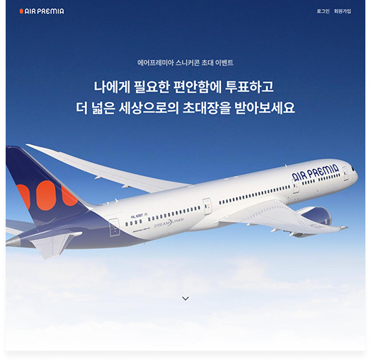
Air Premia · Awareness & Growth Design
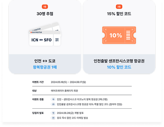
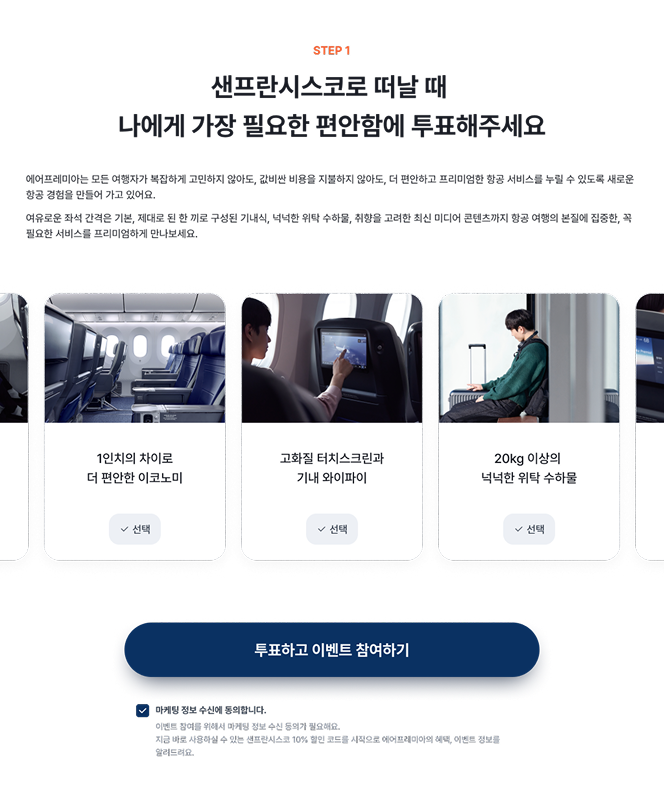
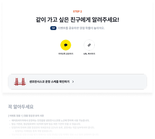
유료 마케팅 없이, 기획부터 데이터 트래킹, 결과 분석까지 직접 소유한 두 개의 성장 캠페인. Two growth campaigns, zero paid marketing. I owned design, data tracking, and results analysis end to end.
"디지털 네이티브 항공사라면 이벤트 참여 방식도 달라야 합니다."
"A digital-native airline should engage users differently."
기획 원칙design principle
에어프레미아는 2024년 코로나로 잃어버린 기반을 다시 세우는 시기였습니다. 공식 홈페이지 중심의 직접 판매, 사용성 개선, 인지율 확보가 핵심 과제였고, 저는 UX 리드로서 설계와 실행을 담당했습니다.2024 was Air Premia's rebuilding year, recovering the foundation lost during the pandemic. Direct sales through the official website, UX improvements, and brand awareness were the core challenges. As UX Lead, I owned the design and execution.
이 페이지는 그 중 인지율 개선을 목적으로 기획한 두 가지 캠페인 디자인을 다룹니다. 전략 수립, 데이터 트래킹 설계, 디자인, 결과 분석까지 모두 직접 수행했습니다.This page covers two awareness campaigns I designed and measured, from strategy and data tracking through design execution and results analysis.
Dec 2024 · Designer + Data Eng. + Frontend Eng. · Zero paid media
연말 특수를 앞두고 에어프레미아의 브랜드 인지도는 1%에 머물렀습니다. 신규 고객에게 USP와 디지털 항공사 이미지를 각인시키는 것이 시급했습니다.Heading into the year-end season, Air Premia's brand awareness remained at just 1%. There was urgent need to communicate our USP and digital-native identity to new customers.
단순한 이벤트 공지나 할인 배너는 한계가 있었습니다. 사용자가 데이터를 소비하는 것이 아니라 참여하게 만들어야 했습니다. 그리고 참여 장벽을 낮춰야만 바이럴이 가능했습니다.A generic banner or promotion would not cut it. Users needed to participate in the data, not just consume it. And lowering the participation barrier was the only path to virality.
퀴즈 형식으로 실적 데이터를 제공하면 수동적 읽기보다 브랜드 인지와 신뢰가 높아질 것이다.Presenting performance data as a quiz will build stronger brand recall and trust than passive content consumption.
비회원도 참여 가능하게 설계하면 진입 장벽이 낮아져 참여율과 바이럴 계수가 높아질 것이다.Allowing non-member participation will lower the entry barrier enough to dramatically increase both participation rate and viral coefficient.
긴 스크롤 페이지에 데이터를 나열하면 사용자는 읽지 않습니다. 한 화면에 하나의 정보만 노출하는 스토리 형식을 채택해 정보 습득 부담을 없애고 자연스럽게 다음 화면으로 이어지는 흐름을 만들었습니다.Users don't read long scrolling data dumps. We adopted a story format, one fact per screen, eliminating cognitive load and creating natural forward momentum between screens.
단순히 성장 지표를 보여주는 대신 사용자가 직접 정답을 맞히도록 설계했습니다. 맞히든 틀리든 브랜드 데이터가 자연스럽게 기억에 남습니다. 능동적 참여는 수동적 읽기보다 훨씬 강한 인지를 만듭니다.Instead of showing metrics, users guess the answer themselves. Whether right or wrong, the brand data sticks. Active participation creates stronger recall than passive reading.
일반적인 항공사 이벤트는 로그인이 필수입니다. 이 장벽이 신규 사용자의 참여를 막습니다. 참여 자체에 집중하고 가입은 이벤트 종료 시점에 자연스럽게 유도하는 방식으로 순서를 바꿨습니다.Typical airline events require login. That barrier blocks new users entirely. We flipped the order: participate first, sign up naturally at the end.
참여 버튼이 특정 위치에만 있으면 스크롤 중 참여 의지가 생겨도 다시 찾아야 합니다. 하단 고정 CTA를 통해 어느 지점에서든 즉시 참여할 수 있도록 해 이탈을 최소화했습니다.If the CTA only appears at one point, users who want to participate mid-scroll have to hunt for it. A sticky bottom CTA lets them act at the exact moment of intent.
같은 톤의 이벤트는 기억에 남지 않습니다. 에어프레미아의 시그니처 기내식인 떡갈비, 미국 취항 데이터 등 경쟁사와 명확히 다른 요소들을 전면에 배치해 이벤트 자체가 브랜드 경험이 되도록 설계했습니다.Generic copy is forgotten immediately. We built the campaign around specifically Air Premia elements so the event itself became a brand experience, not just an announcement.
가장 큰 학습은 "장벽 제거"가 UX 개선보다 큰 전환율 개선을 만든다는 것이었습니다. 퀴즈 UI나 스토리 형식보다 "가입 불필요"라는 단 하나의 결정이 12배 전환을 만들었습니다. 이후 모든 캠페인 설계에서 이 원칙을 우선 검토합니다.The biggest learning: removing a barrier drives more conversion than any UX improvement. The quiz UI and story format helped, but "no signup required" was the single decision that created the 12x lift. This principle now leads every campaign I design.
May 2024 · 137,526 visitors · 40% CVR
샌프란시스코 첫 취항을 기념해 에어프레미아의 브랜드와 USP를 자연스럽게 알리기 위한 프로모션을 기획했습니다. 연말결산에서 검증한 낮은 장벽 설계 원칙을 더 큰 스케일에 적용했습니다.To commemorate our inaugural flight to San Francisco, we designed a campaign to naturally introduce Air Premia's brand and USPs. The low-barrier design principle proven in the Year-End campaign was applied at larger scale.
경품 항공권과 15% 할인코드를 상단에 배치해 참여 동기를 먼저 만들었습니다. 조건을 먼저 제시하는 일반적인 이벤트 구조와 반대 방향으로 설계했습니다.Prizes and a discount code surfaced immediately, motivating users before making any ask. Deliberately reversed the typical event structure that leads with requirements.
"나에게 가장 필요한 편안함"을 직접 선택하게 하면 USP를 자연스럽게 습득하게 됩니다. 설명이 아닌 경험으로 브랜드 강점을 전달하는 방식입니다.Asking users to pick "the comfort that matters most to me" naturally teaches USPs through the act of choosing, delivering brand strengths through experience, not explanation.
미선택·동의 누락으로 인한 이탈을 막는 상세 피드백을 정의했고, 이벤트 공유하기를 통해 바이럴 계수를 측정 가능하게 설계했습니다.Detailed feedback states prevent drop-off from unselected options or missing consent. Built-in sharing made the viral coefficient measurable from day one.
두 캠페인에서 반복 확인한 것은 하나입니다. 진입 장벽을 낮추는 것이 가장 강력한 성장 디자인 결정입니다.Both campaigns confirmed the same thing: removing the entry barrier is the single most powerful growth design decision.
이후 캠페인 설계에서 저는 "가입이 필요한가?"를 항상 첫 번째로 검토합니다. 대부분의 경우 답은 아니오입니다.In every campaign I design since, "is signup actually required?" is always the first question. Most of the time, the answer is no.
두 캠페인 모두 비회원 참여 이후 회원 전환 유도 경험을 더 정밀하게 설계할 수 있었습니다. 참여 완료 직후 가입 플로우의 마찰을 더 줄였다면 신규 가입률이 더 높았을 것입니다.Both campaigns could have had a more refined post-participation signup flow. Reducing friction at that exact moment, right after engagement peaked, would have pushed new member numbers higher.
캠페인은 일회성이지만 데이터 트래킹 설계와 결과 분석 방법은 이후 모든 프로젝트의 기준이 되었습니다. 측정 가능한 설계는 사후 분석이 아니라 설계 단계부터 시작해야 합니다.The campaigns were one-off, but the data tracking framework and results analysis methodology became the standard for everything after. Measurable design starts at the design stage, not after launch.