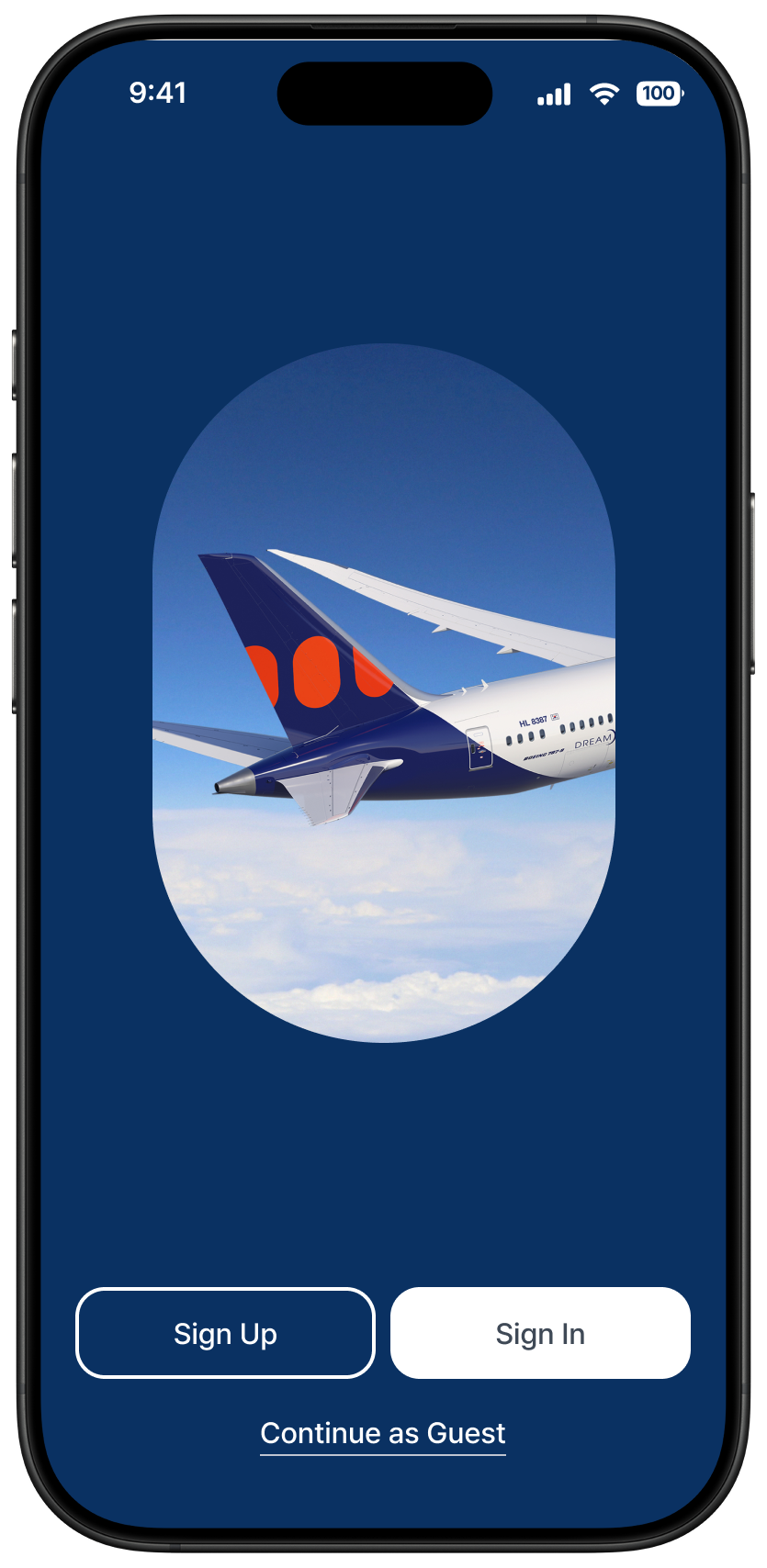
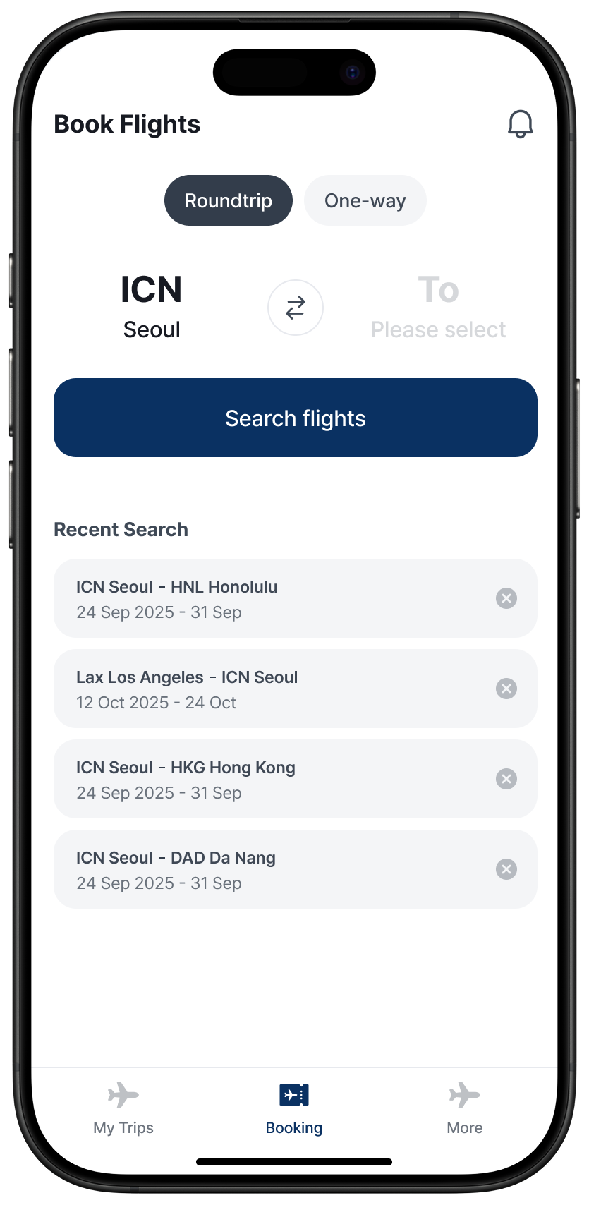
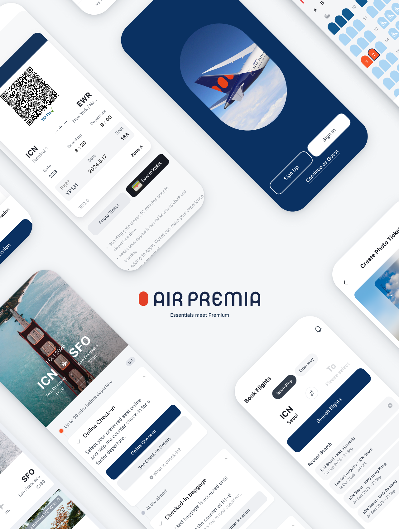
Air Premia · Mobile App

"앱을 만들어달라"는 요청에서 시작한 일.
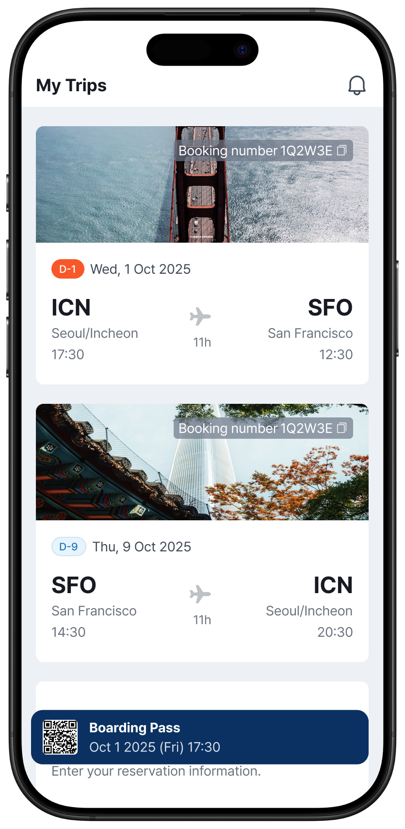
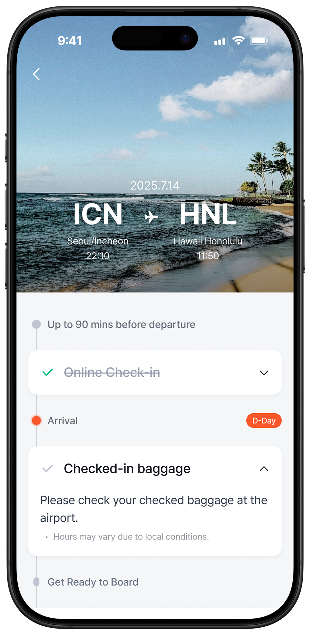
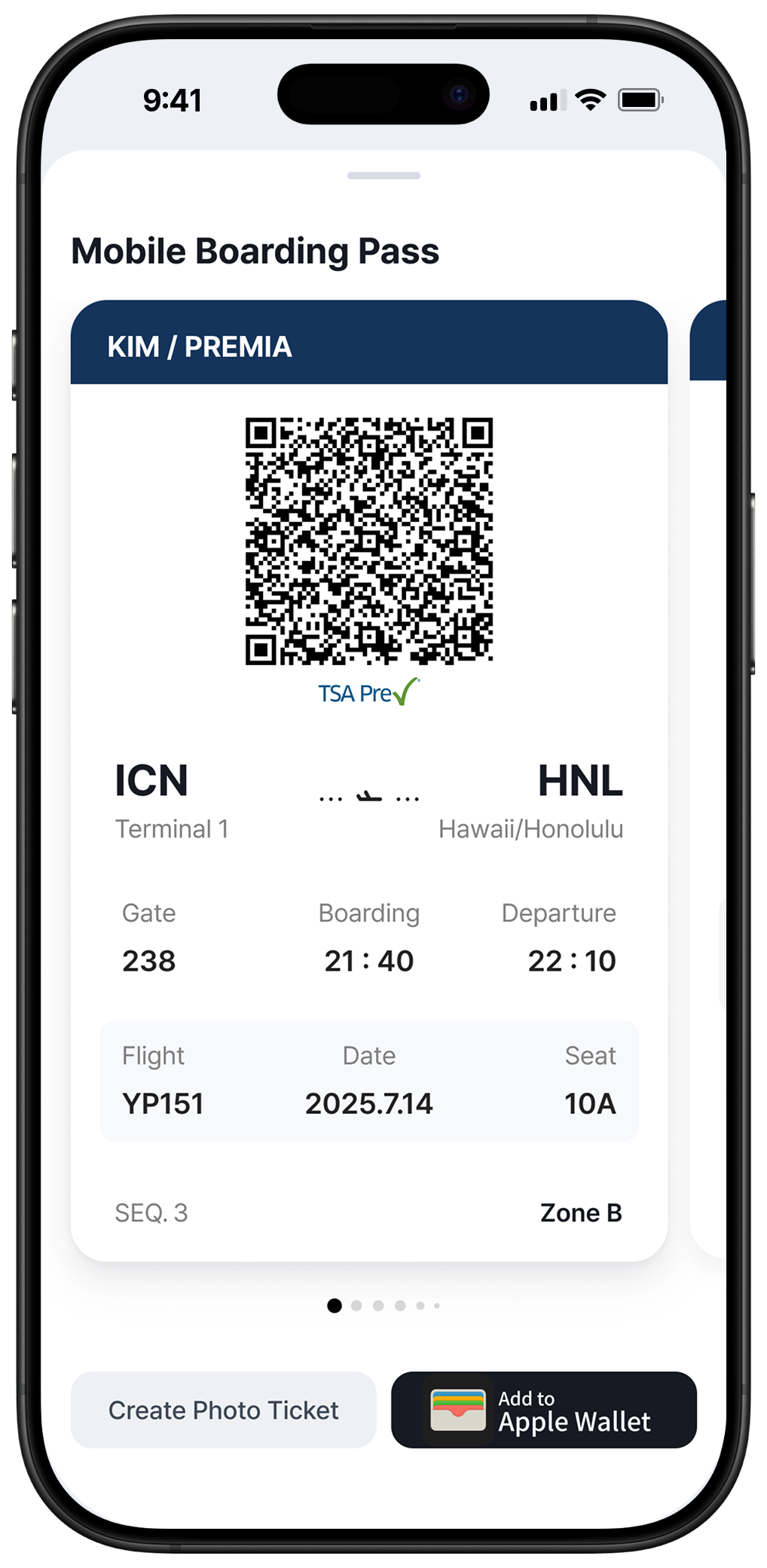
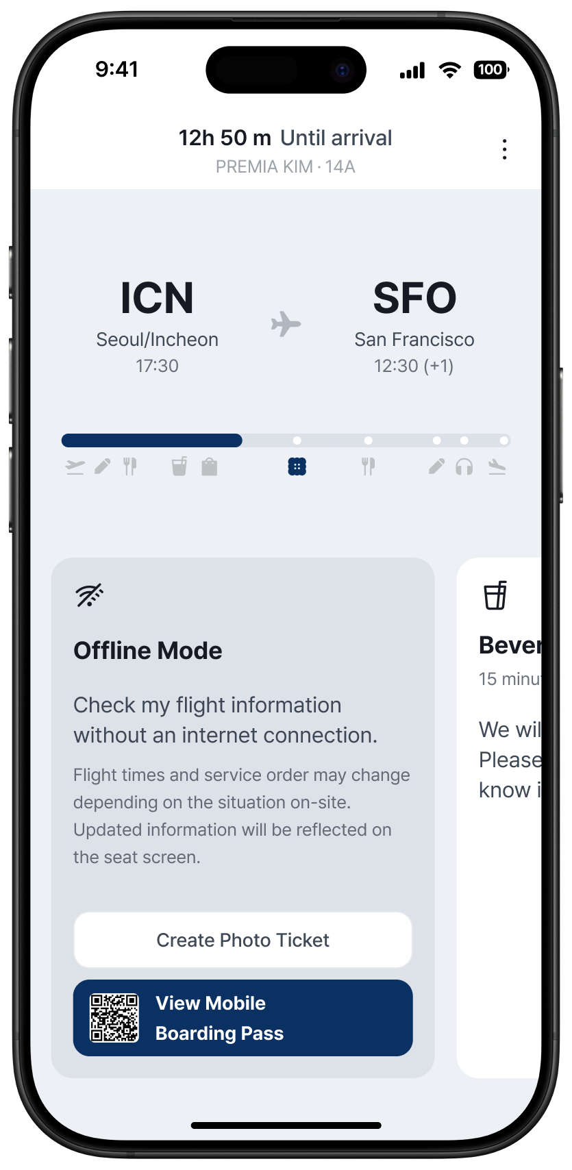
진짜 문제는, 사용자가 항공사 앱을
열 이유가 없다는 것
이었습니다.
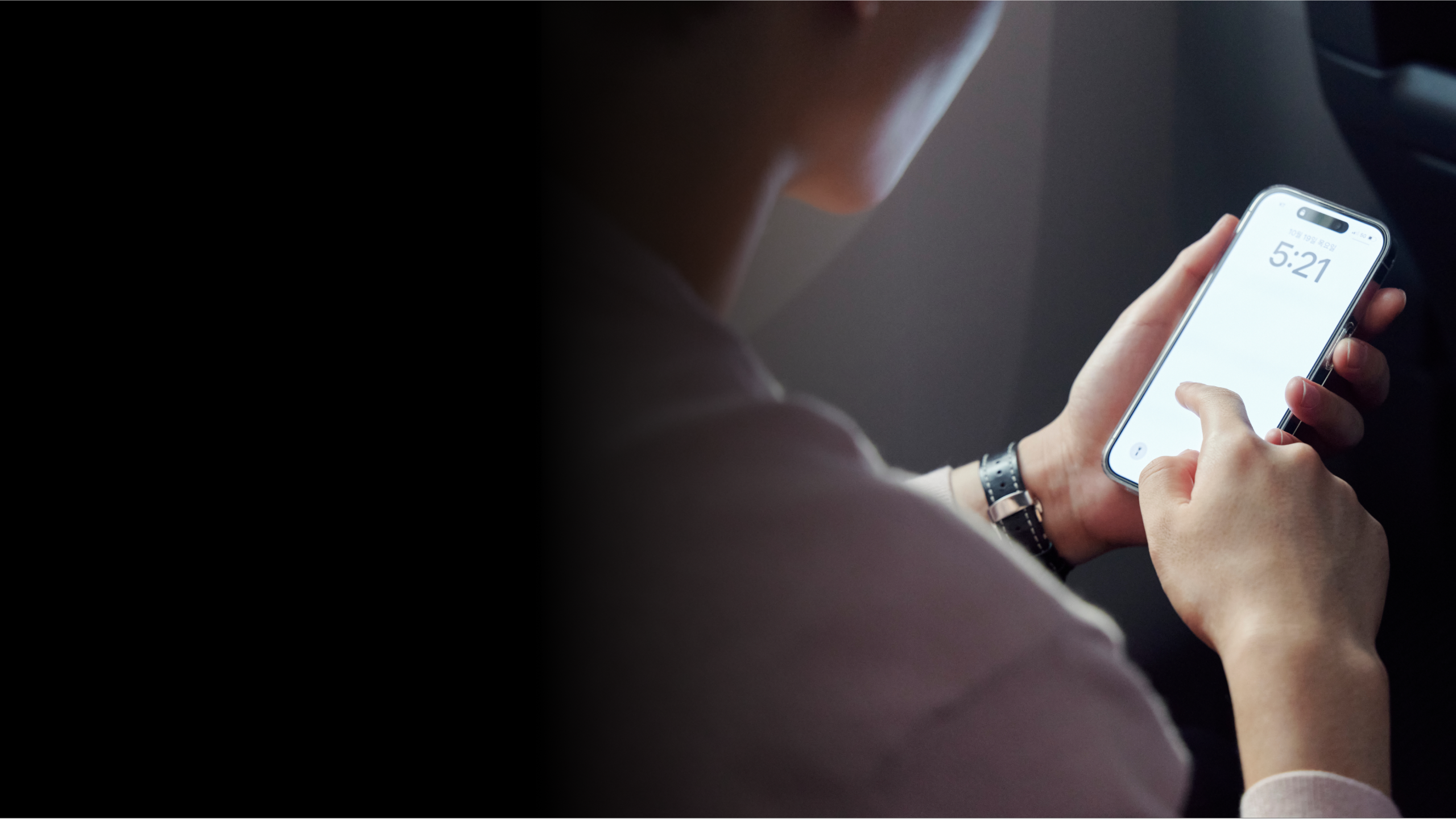
The brief was "build an app."
The real problem was:
users don't open airline apps
until they have to.

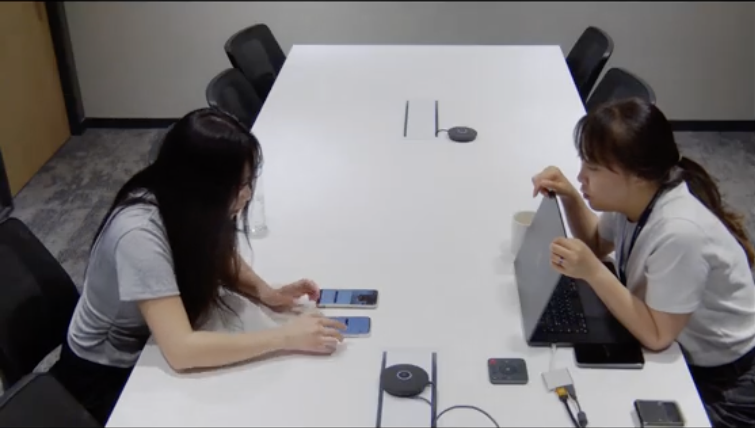
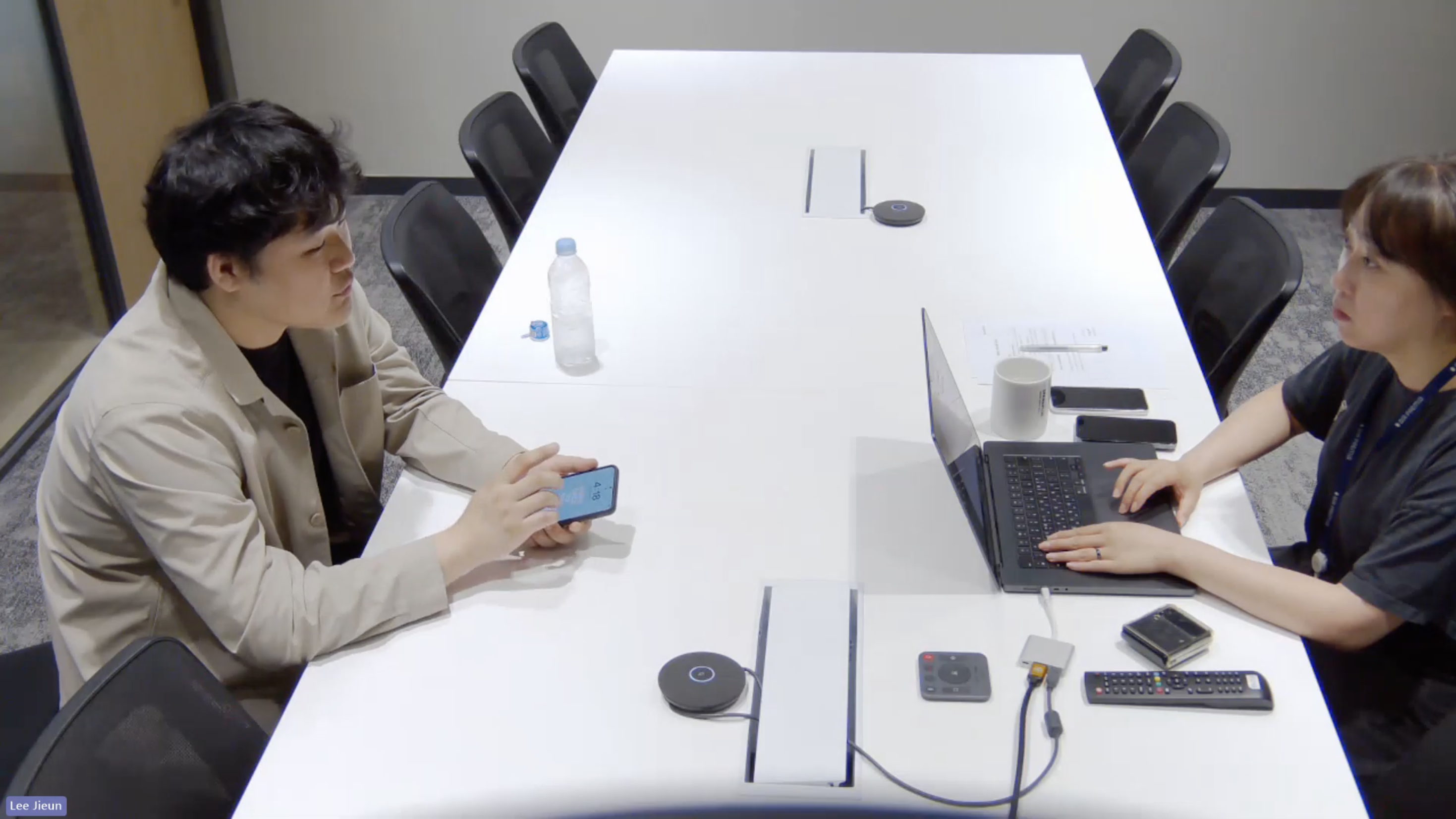
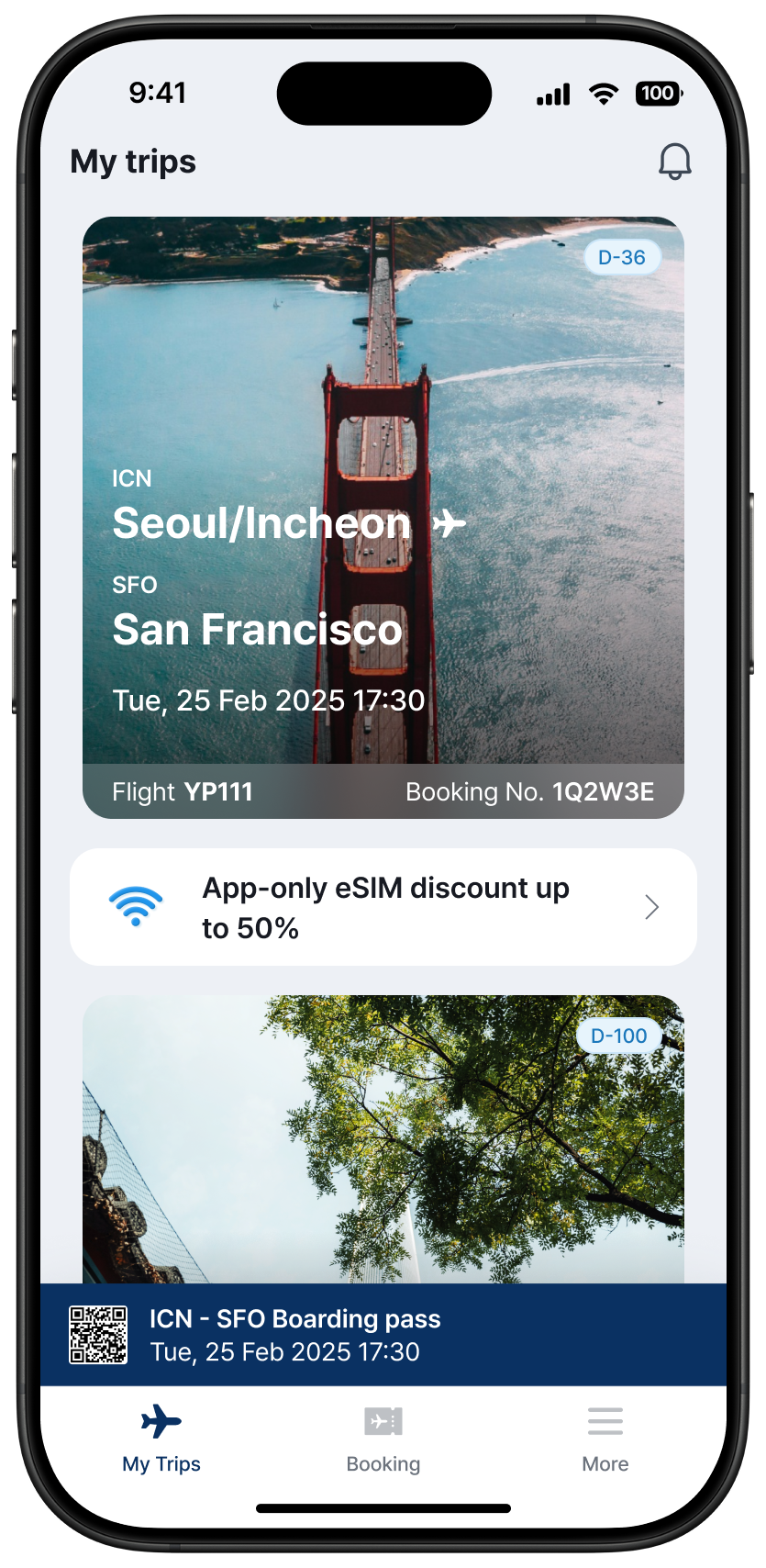
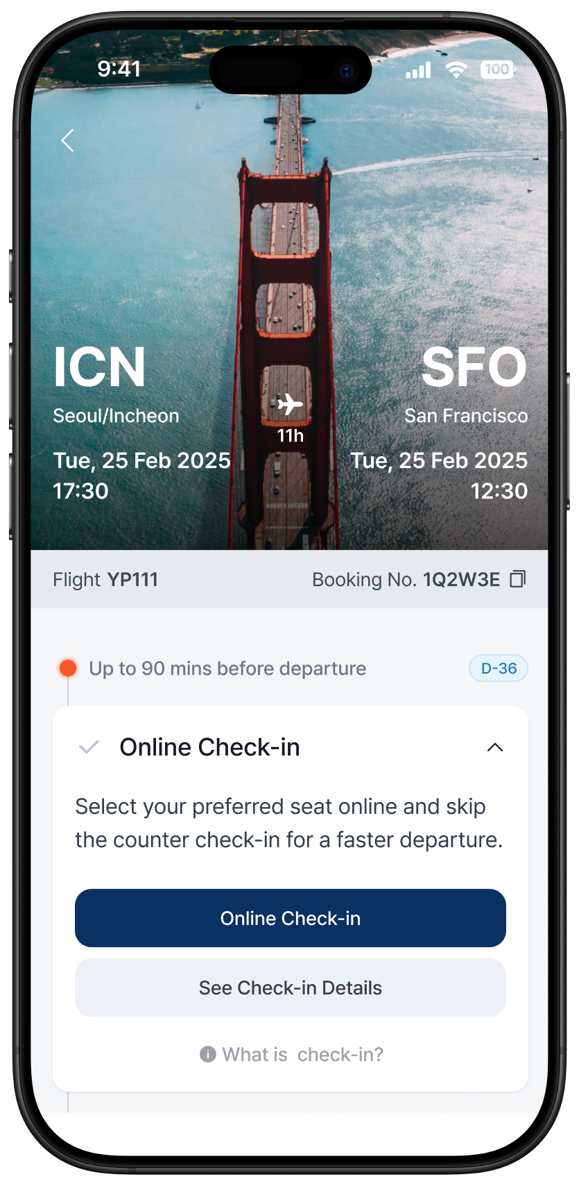
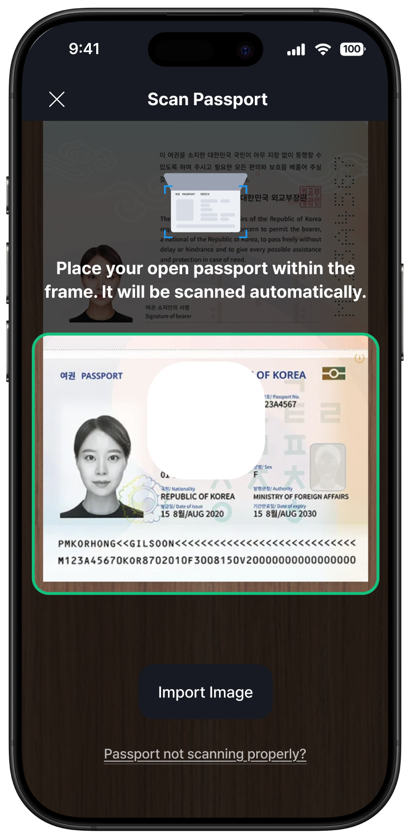
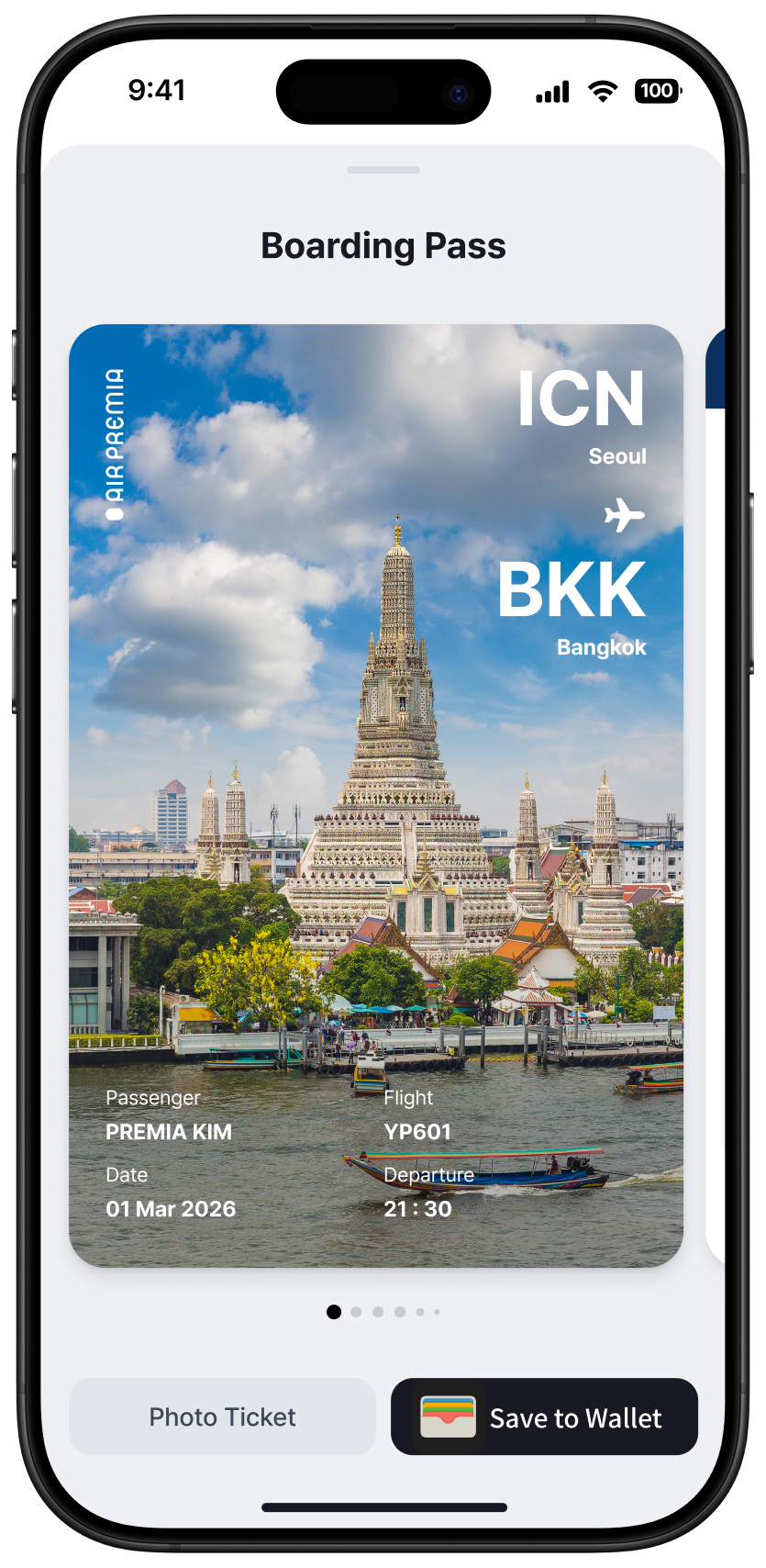
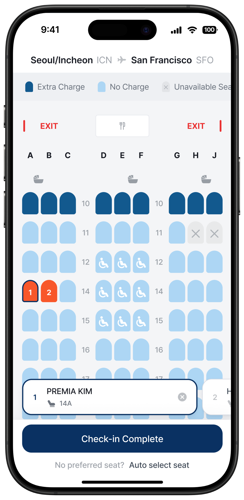
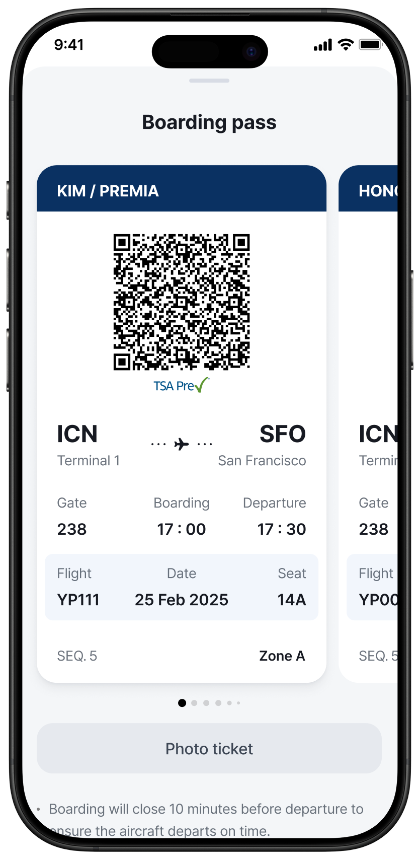
모바일 앱 전 과정을 직접 소유 — 가설 수립, 사용자 리서치, UT 운영, 출시, 지표 분석까지. Led end-to-end design of Air Premia's mobile app — from hypothesis setting and user testing to shipped product and measurable outcomes.

App ↗

Overview

"2024년에 모바일 앱이 없는 항공사가 있다고? 신선했어요"

"An airline with no mobile app — in 2024? That's actually kind of refreshing."

실제 사용자 인터뷰 중 From a real user interview

2024년 4월까지 에어프레미아에는 모바일 앱이 없었습니다. 코로나 위기를 최소 인원으로 버텨온 결과였지만, 모바일로 모든 것을 해결하는 사용자들에게 이는 더 이상 미룰 수 없는 공백이었습니다. Air Premia had no mobile app as late as April 2024. A gap born from pandemic survival, but no longer acceptable for users who manage everything on their phones.

저는 리서치를 통해 핵심 방향을 정의했습니다. 사용자가 앱을 가장 필요로 하는 순간은 예매가 아니라, 예매 이후부터 탑승까지입니다. 이 인사이트를 바탕으로 "탑승에 최적화된 앱"이라는 명확한 방향을 설정하고, 가설 수립부터 IA, UT, 출시 후 지표 분석까지 전 과정을 직접 소유했습니다. Research revealed the core insight: users need the app most not during booking, but from post-purchase through boarding. I owned the full process, from hypothesis setting and IA to UT facilitation and post-launch measurement.

Role Product Designer (App)
Scope 리서치 · IA · 인터랙션 · UT · 출시 후 지표 분석 Research · IA · Interaction · UT · Post-launch measurement
Skills
User Research Usability Testing Hypothesis-driven Design Information Architecture Interaction Design Figma
Time May 2020 – Present

Key Achievement

모든 숫자는 과정에서 내린 디자인 결정의 직접적인 결과입니다. Each number is a direct outcome of a design decision made during the process.

200K+
누적 다운로드Cumulative Downloads

핵심 가설 검증: 사용자는 예매 직후 스스로 앱을 찾아 다운로드합니다. 유료 UA 없이 오가닉만으로 달성했습니다. Users organically find the app right after booking. Achieved without any paid UA, organic installs only.

×2
앱 로그인율 (웹 대비)App Login Rate vs. Web

레거시 앱의 30분 세션 제한을 완전히 제거한 직접적 결과. Direct result of eliminating the legacy app's 30-minute session limit entirely.

15%
앱 기여 매출 비중Of Total Revenue via App

예매 탭은 원래 브리프에 없었습니다. UT에서 인앱 예매 수요를 발견하고 추가했습니다. The booking tab wasn't in the brief. UT revealed in-app booking demand, so we added it.

01 — Problem

아무도 정의하지 않은 공백 The gap no one had defined

2024년 하반기, 모바일을 통한 예약 비율이 처음으로 PC를 넘어섰습니다. 그런데 에어프레미아에는 앱이 없었습니다.

앱이 없다는 건 단순히 채널 하나가 빠진 게 아닙니다. 사용자는 체크인이 필요할 때마다 네이버를 검색하고, 홈페이지에 로그인하고, 원하는 메뉴를 직접 찾아가야 했습니다. 항공 여행에서 가장 불안하고 바쁜 순간에, 사용자를 혼자 내버려 두는 구조였습니다.

문제는 "앱을 만들자"가 아니었습니다. "사용자가 가장 필요로 하는 순간이 언제인가"를 먼저 정의해야 했습니다.
In the second half of 2024, mobile bookings surpassed desktop for the first time. But Air Premia had no app.

The absence wasn't just a missing channel. Every time users needed to check in, they had to search on Naver, log into the website, and navigate on their own, at the most stressful, time-pressured moments of travel.

The real question wasn't "should we build an app?" It was: "what does a traveler actually need, and when?"

02 — Hypothesis

기능보다 먼저, 가설을 세웠습니다 We didn't start with features. We started with questions.

H1
Download trigger

대부분의 사용자는 예매 완료 직후 앱을 스스로 찾아 다운로드할 것이다. Most users will organically search for and download the app right after completing a web booking.

H2
Login & session

사용자는 매번 로그인하지 않고 앱에 머물기를 기대할 것이다. 자동로그인과 세션 유지는 재방문을 늘릴 것이다. Users will expect to stay logged in. Auto-login and session persistence will increase return visits.

H3
Boarding pass & check-in

사용자는 모바일 탑승권을 기대하며, 예약 조회와 체크인을 하나의 흐름 안에서 해결하기를 원할 것이다. Users will expect a mobile boarding pass and want to handle check-in and reservations in one unified flow.

H4
Push notifications

적절한 시점의 정보성·마케팅 알림은 환영받을 것이다. Timely, relevant push notifications will be welcomed. Phase 2 — out of MVP scope

H5
In-app booking

일부 사용자는 앱을 통해 직접 항공권을 예매하려 할 것이다. Some users will want to book directly through the app. Exploratory — validate demand only

03 — Goal

성공의 기준을 먼저 정의했습니다 Defining what success looks like

Primary Goal

오가닉 다운로드 전환 Drive organic app installs

목표: 앱 스토어 '에어프레미아' 검색 최상단 노출
예상 수치: 하루 탑승객 1,500명 × 전환율 1% = 일 15건+
Goal: #1 result for "Air Premia" in App Store search
Target: 1,500 daily passengers × 1% conversion = 15+ installs/day

Secondary Goals

자동로그인으로 앱 재방문 빈도 향상 (기준: 웹 1,843세션/일)Increase return frequency via auto-login (Baseline: web 1,843/day)
예약 조회 + 체크인 통합으로 이탈 최소화Reduce friction by merging reservations + check-in
모바일 탑승권 발급 및 사용률 증가Grow mobile boarding pass issuance rate

Exploratory Goal

인앱 예약 수요 존재 여부 확인 → 수요 확인 시 Phase 2에서 예매 탭 추가Validate in-app booking demand → scope into Phase 2 if confirmed

04 — Solution

핵심 디자인 결정 Key Design Decisions

Decision 01
로그인 세션 무제한Unlimited login session
레거시: 30분마다 만료Legacy: expired every 30 min

레거시 앱은 30분마다 세션이 만료됐습니다. 사용자 리서치에서 "매번 로그인해야 하는 앱은 쓰기 싫다"는 피드백이 반복됐고, 세션 제한을 완전히 제거했습니다.The legacy app expired sessions every 30 minutes. Research showed this was the top friction point: "I won't use an app that makes me log in every time." Heard repeatedly. We removed the limit entirely.

앱 로그인율 웹 대비 2배App login rate 2× vs. web
Decision 02
홈 화면: 예약·체크인 통합Unified home screen
다가오는 여정 우선 노출Upcoming trips first

사용자는 "예약 내역"과 "체크인 목록"을 구분하지 않습니다. 두 개의 분리된 메뉴는 혼란만 만들었습니다. 다가오는 여정을 중심으로 하나의 화면에 통합했습니다.Users don't distinguish between "my bookings" and "check-in list." Splitting them created unnecessary confusion. We merged them, surfacing upcoming trips first.

Decision 03
모바일 탑승권: 플로팅 바Floating boarding pass bar
전 화면 접근 가능Accessible from any screen

탑승권이 필요한 순간은 예측할 수 없습니다. 어떤 화면에서든 즉시 꺼낼 수 있도록 플로팅 바로 제공했습니다. UT에서 8명 중 8명이 이 방식을 압도적으로 선호했습니다.The moment you need your boarding pass is unpredictable. We made it instantly accessible from any screen via a floating bar. In UT, all 8 participants strongly preferred this over tab navigation.

Decision 04
여정 상세: 타임라인 가이드Timeline-based trip detail
예약~탑승 단계별 안내Booking through boarding

항공 여행의 불안은 대부분 "지금 내가 뭘 해야 하지?"에서 옵니다. 예약부터 탑승까지 단계별로 안내하는 타임라인을 설계해 사용자가 다음 행동을 항상 명확히 알 수 있도록 했습니다.Most travel anxiety comes from not knowing what to do next. We designed a step-by-step timeline, from booking through boarding, so users always have a clear next action.

Decision 05
체크인: WebView + Native 통합Hybrid architecture
유지보수 비용 최소화Minimize maintenance cost

항공사 체크인 정책은 자주 바뀝니다. 정책 변경마다 앱 업데이트가 필요한 구조는 지속 불가능합니다. 핵심 UI는 Native로, 정책 의존적인 부분은 WebView로 분리해 유지보수 비용을 최소화했습니다.Airline check-in policies change frequently. A fully native implementation would require an app update every time. We split the architecture: core UI in Native, policy-dependent flows in WebView.

05 — MVP Launch

시장에서 온 첫 번째 신호 First signal from the market

2025. 02. 26, iOS Korea only · Zero paid marketing

10,000 다운로드downloads

8주 만에. 유료 마케팅 없이, 오가닉 다운로드만으로. In 8 weeks. Pure organic — no UA campaign, no paid install.

H1 가설을 직접 검증한 결과입니다. 사용자는 예매 완료 직후 스스로 앱을 찾아 다운로드했습니다. 앱을 알리지 않아도, 여행이 알렸습니다. This directly validated H1: users sought out the app on their own, right after booking. The journey promoted the app — not the other way around.

하지만 숫자만으로는 충분하지 않았습니다. 다운로드한 사용자가 실제로 앱을 어떻게 쓰는지 확인이 필요했습니다. But downloads alone weren't enough — we needed to see how real users actually experienced it.

9+
한국 외 활발한 이용 국가Active countries beyond Korea
iOS 한국 단독 출시임에도 해외 다운로드 지속 발생Organic international installs despite Korea-only launch
#43
앱스토어 여행 카테고리App Store · Travel category
유료 광고 없이 오가닉만으로 달성한 카테고리 순위Ranked purely through organic installs, zero paid ads

User Reactions

기다렸던 사용자들의 목소리 Heard from users who had been waiting

User review
User review
User review

05-B — MVP Design

출시된 화면 What we shipped

레거시 30분 세션 제한 → 무제한 유지로 변경 Legacy 30-min session limit → removed entirely
Login screen
예약·체크인 통합 홈 + 플로팅 탑승권 바 Unified home screen + floating boarding pass bar
Home screen
예약~탑승 타임라인 기반 여정 가이드 Step-by-step timeline from booking to boarding
Trip detail
플로팅 바로 어느 화면에서나 즉시 탑승권 꺼내기 Floating bar — boarding pass in one tap from any screen
Mobile boarding pass

06 — User Research

가설 vs 실제 What we assumed vs. what we found

출시 후 iOS/Android 실사용자 8명 심층 인터뷰. 예약·탑승·체크인 등 실제 사용 시나리오 기반 태스크 수행 + 인터뷰. In-depth interviews with 8 real users (iOS & Android) after launch. Task-based sessions covering booking, check-in, and boarding scenarios.

H1
Download trigger
체크인·탑승 목적으로 다운로드하지만, 앱 존재 자체를 모르는 사용자 다수 발견.Users do download for check-in/boarding — but many didn't know the app existed.
Phase 2: 예매 완료 시점 앱 다운로드 유도 알림 추가Phase 2: Add post-booking prompt to drive app discovery
H2
Auto-login
"매번 로그인하는 앱은 쓰지 않겠다" 반복 확인."I won't use an app that makes me log in every time" — heard repeatedly.
30분 세션 제한 제거 → 로그인율 웹 대비 2배Removed 30-min session limit → login rate 2× vs. web
H3
Boarding pass
특히 수하물 없는 고객에게 탑승권이 앱의 핵심 가치.Especially critical for carry-on-only travelers.
플로팅 바 방식 확정, 전 화면 접근 가능Floating bar confirmed — accessible from any screen
H4
In-flight mode
IFE로 이미 대체되어 수요 낮음.IFE already covers in-flight needs. Demand was low.
스코프 제외, 리소스를 탑승권에 집중Removed from scope, resources redirected to boarding pass UX
H5
Push notifications
적절한 시점의 알림은 긍정적으로 수용.Timely notifications were well received.
Phase 2 우선순위 확정Confirmed as Phase 2 priority
H6
Membership
충성 고객: 멤버십 필수 / 신규 고객: 쿠폰·할인 중심.Loyal users: membership essential / New users: coupons and discounts.
멤버십 메뉴 추가 + 신규 고객 진입점에 쿠폰 노출Added membership menu + coupon entry point for new users

사용성 테스트 피드백 Usability Findings

빈 화면Empty State
예약 없는 첫 사용자에게 홈이 너무 비어 보였습니다.First-time users with no reservations saw a completely empty home screen.
예약 유무에 따라 랜딩 분기. 없는 경우 프로모션·예매 CTA 우선 노출.Split landing by reservation status. No bookings = promotions and booking CTA shown first.
여정카드 가독성Trip card readability
출발·도착 시간이 눈에 안 들어오고, 예약번호·공항코드가 뭉쳐 보였습니다.Departure/arrival times weren't prominent; codes visually cluttered.
정보 위계 재설계. 시간을 가장 크게, 코드류는 보조 정보로.Redesigned information hierarchy: times largest, codes as supporting info.
체크인 UXCheck-in UX
좌석 선택 흐름은 긍정. 문제: 좌석만 변경 불가, 여권 정보 반복 입력.Seat selection flow positive. Issues: seat-only change not possible, repeated passport entry.
여권 정보 저장 추가. 좌석 단독 변경은 시스템 제약으로 Phase 2 검토.Added passport info save. Seat-only change deferred to Phase 2 (system constraint).
모바일 탑승권Mobile boarding pass
플로팅 바 방식 압도적 선호. 오프라인 접근도 기대.Overwhelming preference for floating bar. Offline access expected.
플로팅 바 최종 확정. 오프라인 모드는 Phase 2.Floating bar confirmed. Offline mode: Phase 2.
더보기 메뉴More menu
메뉴 다양성은 긍정. 그러나 멤버십·내 정보 부재로 이탈.Menu variety appreciated, but missing membership and personal info caused drop-off.
내 정보 / 프레미아 멤버십 메뉴 추가.Added My Info / Premia Membership to the menu.
즉시 반영Immediate actions
하단 탭 네비게이션 도입 + 예매 탭 추가Introduced bottom tab navigation + added Booking tab
예약 유무에 따른 홈 랜딩 분기Differentiated home screen based on reservation status
내 정보 / 프레미아 멤버십 메뉴 추가Added My Info / Premia Membership to the menu
여정카드 정보 위계 재설계Redesigned trip card information hierarchy
여권 정보 저장으로 반복 입력 제거Saved passport info to eliminate repeated entry
Phase 2
탑승권 오프라인 모드Boarding pass offline mode
좌석 단독 변경 (시스템 제약 해소 후)Seat-only change (pending system constraint resolution)
푸시 알림 설계 및 테스트Push notification design and testing
예매 완료 시점 앱 다운로드 유도 (H1 보완)Post-booking prompt to drive app discovery (to address the gap in H1)

UT Scenes

테스트 현장 From the sessions

UT scene 1
UT scene 2
UT scene 3
UT scene 4

07 — Results

숫자가 말하는 것 What the numbers said

앱 사용자는 웹 사용자보다 더 자주 돌아오고, 더 많이 구매합니다. App users return more often, and convert at a higher rate.

100K+
Downloads
iOS 한국 한정, 8주 이후 누적iOS Korea only, cumulative after 8 weeks
+61%
예매 전환율 (웹 대비)Booking CVR vs. web
+4%p
+60%
평균 방문 횟수 (웹 대비)Avg. visit frequency vs. web
세션 제거 결정의 직접적 효과Direct effect of removing session limit
야간 예매 (새벽 1–3시) 비율이 웹보다 높습니다Late-night bookings (1–3am) higher on app
앱은 기존 웹이 닿지 못했던 구매 시간대를 열었습니다.The app opened a purchase window that the website couldn't reach.
일요일 예매율이 웹 대비 유의미하게 높습니다Sunday bookings meaningfully higher on app
주말 여가 탐색에서 앱이 더 자주 선택되고 있습니다.Weekend leisure browsing increasingly favors the app.
Still in progress

모바일 탑승권 사용률은 현재 웹보다 낮습니다. 알림톡 연결 이슈로 사용자가 웹으로 우회하는 것으로 파악됩니다. 기술팀과 함께 연결 플로우를 개선 중입니다. Mobile boarding pass usage is currently lower than web. We identified a KakaoTalk notification redirect issue causing web fallback. A fix is in progress with the engineering team.

Final Product

출시된 최종 화면 What shipped

Final screen 1
Final screen 2
Final screen 3
Final screen 4
Final screen 5
Final screen 6
Final screen 7
Final screen 8

"앱을 만들어달라"는 요청에서 시작해, 탑승 경험을 제품 문제로 재정의하고 전체 매출의 15%를 견인하는 채널을 만들었습니다. What started as "build an app" became a new revenue channel, and evidence that boarding experience is a product problem, not an ops problem.

Air Premia App — final product overview