Hyundai Capital · Service Renewal

금융의 복잡함을
명확하게 다시 설계하는 일
Redesigning financial complexity
into clarity

Auto Loan, Credit Loan, Mortgage — 현대캐피탈의 세 가지 핵심 대출 상품을 ALM 전략 기반으로 통합 리뉴얼. 고객이 자신에게 맞는 상품을 스스로 발견하고 신청하는 경험을 재설계했습니다.

A unified renewal of Hyundai Capital's three core loan products — Auto Loan, Credit Loan, and Mortgage — under an ALM strategy. Redesigning the experience so customers can find and apply for the right product on their own.

Role UX Lead / Team Leader
Period Feb – Jun 2017
Scope Auto Loan · Credit Loan · Mortgage
Tools Sketch · InVision

Overview

현대캐피탈이 원한 것 — ALM 전략의 시작 What Hyundai Capital wanted — the start of ALM strategy

현대캐피탈은 글로벌 수준의 금융 서비스 기업으로, 자동차 할부부터 신용대출, 주택담보대출까지 폭넓은 상품군을 보유하고 있었습니다. 그러나 각 상품은 별도 시스템에서 운영되어 고객 경험이 파편화돼 있었고, 고객이 자신에게 맞는 상품을 스스로 선택하기 어려운 구조였습니다.

Hyundai Capital is a global financial services company with a broad portfolio — auto financing, personal credit loans, and mortgages. But each product lived in its own system, fragmenting the customer experience and making it hard for customers to independently find and select the right product for their situation.

ALM(Asset Liability Management) 전략 리뉴얼은 단순한 UI 개선이 아니었습니다. 상품 구조의 복잡성을 고객 관점에서 다시 정의하는 것이 핵심 과제였습니다. The ALM strategy renewal wasn't a simple UI refresh. The core challenge was redefining product complexity from the customer's perspective.

Role UX Lead / Team Leader
Period Feb – Jun 2017
Products
Auto Loan Credit Loan Mortgage
Tools
Sketch InVision Zeplin
Design KW
Clear Flexible Sympathetic

Problem

고객은 목적이 있었지만, 서비스는 길을 안내하지 않았다 Customers had intent — the service didn't show the way

현대캐피탈에 로그인하는 고객의 대부분은 명확한 목적을 가지고 있었습니다 — 연체 납부, 신규 대출 신청, 잔액 확인. 하지만 서비스는 그 목적을 연결하지 못했습니다.

Most customers who logged in to Hyundai Capital had a clear purpose — pay a late bill, apply for a loan, check their balance. The service wasn't connecting them to that purpose.

문제 1

상품이 아닌 시스템 기준으로 설계된 구조

Structure built for systems, not products

Auto Loan, Credit Loan, Mortgage가 각각 독립된 레거시 시스템으로 운영되어, 고객이 하나의 경험으로 인식하기 어려웠습니다.

Each product ran on its own legacy system, making it nearly impossible for customers to experience them as a coherent whole.

문제 2

정보 과부하 — 고객이 선택해야 할 것이 너무 많았다

Information overload — too many choices, no guidance

대출 금리, 한도, 기간 등의 정보가 고객 상황과 무관하게 일괄 노출되었습니다. 고객은 자신에게 유리한 조건을 스스로 계산해야 했습니다.

Interest rates, limits, and terms were displayed all at once regardless of the customer's situation. They had to calculate what was best for themselves.

문제 3

신뢰를 쌓는 커뮤니케이션 부재

No communication that built trust

금융 상품에서 고객이 느끼는 불안감 — "이 조건이 나에게 맞는가?" — 을 해소하는 언어와 피드백이 없었습니다.

The anxiety of financial decisions — "Is this right for me?" — was never addressed through language or feedback in the experience.

Research & Ideation

현장에서 시작한 문제 정의 Problem definition from the field

사용자 인터뷰와 현장 관찰에서 반복적으로 발견된 패턴이 있었습니다. 고객은 "좋은 상품을 찾는" 것이 아니라, "내가 받을 수 있는 것"을 파악하는 데 에너지를 쏟고 있었습니다. 이 차이가 설계 방향을 바꾸었습니다.

A consistent pattern emerged from user interviews and field observation. Customers weren't trying to find a "good product" — they were spending energy just figuring out what they could actually get. That distinction changed everything about the design direction.

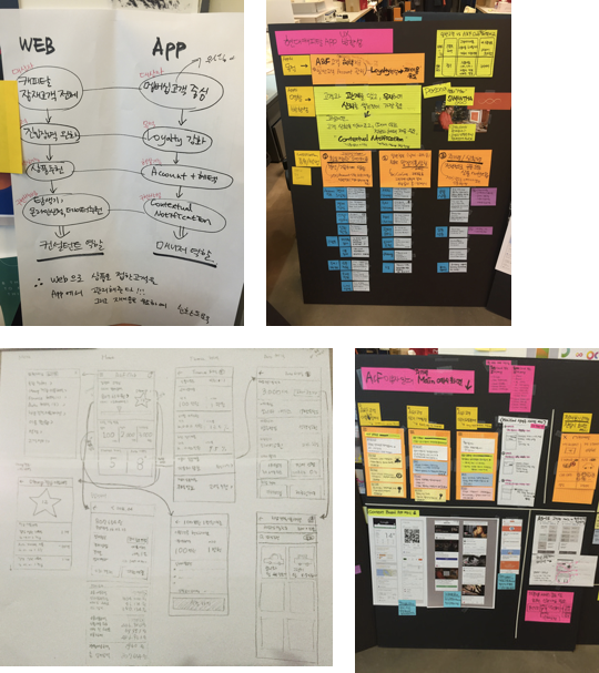
팀은 여정 맵, 콘텍스추얼 인콰이어리, 내부 데이터 분석을 병행했습니다. "고객이 실패하는 지점"과 "고객이 이탈하는 지점"이 다르다는 것을 데이터로 확인했고, 이를 설계 기준으로 삼았습니다. The team combined journey mapping, contextual inquiry, and internal data analysis. We confirmed through data that "where customers fail" and "where customers drop off" are different — and used that as the design foundation.

리서치 현장 — 데스크탑 환경 퍼소나 보드 여정 맵 — 이탈 지점 분석
와이어프레임 초기안 — 로우피델리티 프로토타입 와이어프레임 — A/B 테스트 방향안

A/B Test

두 방향을 두고 검증했다 Validating two competing directions

정보 구조와 상품 탐색 방식에 대해 두 가지 방향을 A/B 테스트로 검증했습니다. 사용성 테스트 참여자 16명, 태스크 완료율과 인지 부하를 기준으로 판단했습니다.

Two directions for information architecture and product discovery were validated through A/B testing with 16 usability test participants, measured by task completion rate and cognitive load.

Version A — 상품 중심

상품 탭으로 진입 — Auto / Credit / Mortgage

Enter by product tab — Auto / Credit / Mortgage

기존 시스템 구조를 반영한 탭 구성. 고객은 상품명을 먼저 선택해야 했습니다. 이미 상품을 아는 사람에게 유리했지만, 처음 방문하는 고객은 탐색에 실패하는 경우가 많았습니다.

Tab structure reflecting existing system logic. Customers had to select a product name first. This worked for returning users, but first-timers frequently failed to navigate.

Version B — 목적 중심 (채택)

목적으로 진입 — "어떤 도움이 필요하세요?"

Enter by intent — "What do you need help with?"

고객의 목적(자동차 구매, 급전 필요, 내 집 마련)에서 시작하는 구조. 상품은 목적에 맞는 것만 추천 형태로 노출했습니다. 태스크 완료율 +31%, 탐색 시간 −40%.

Starting from customer intent (buying a car, urgent cash, home purchase). Only relevant products were surfaced as recommendations. Task completion +31%, exploration time −40%.

Design Principle 01

Clear — 단순한 형식, 명확한 가치 Clear — Simple form, unambiguous value

Clear

고객이 결정을 내리기 위해 필요한 정보만

Only the information needed to decide

금융 상품 페이지는 전통적으로 모든 조건을 한꺼번에 보여주는 방식이었습니다. 우리는 이를 뒤집었습니다. 고객의 상황(목적, 예상 금액, 신용 등급)을 먼저 파악한 뒤, 그에 맞는 조건만 노출하는 구조로 전환했습니다.

Financial product pages traditionally showed all terms at once. We inverted this. First understanding the customer's situation (intent, expected amount, credit grade), then surfacing only relevant terms.

실시간 대출 한도·금리 계산기 — 고객이 자신의 조건을 입력하면 즉시 결과를 확인할 수 있도록

Real-time loan limit & rate calculator — immediate results as customers input their parameters

상품 비교 로직 단순화 — 3개 상품을 동시 비교하되, 고객 상황에 무관한 항목은 접어 처리

Simplified product comparison — 3 products side-by-side, but irrelevant parameters collapsed

단계별 폼 설계 — 한 화면에 하나의 질문만 노출하는 Progressive Disclosure

Step-by-step form design — Progressive Disclosure showing one question per screen

Clear 원칙 — 대출 계산기 UI Clear 원칙 — 단계별 폼 디자인 Clear 원칙 — 상태 인식 UI

Design Principle 02

Flexible — 고객의 행동을 따라가는 인터페이스 Flexible — Interface that follows user behavior

Flexible

목적에 따라 다르게 반응하는 구조

Structure that adapts to intent

고객이 "자동차 할부"를 보러 온 경우와 "급전이 필요한" 경우는 보여줘야 하는 정보, 폼의 순서, 그리고 커뮤니케이션 방식이 다릅니다. Flexible은 하나의 UI가 다양한 목적에 맞게 적응하는 방식을 정의합니다.

A customer visiting for auto financing and one who needs emergency cash need different information, different form sequences, and different communication styles. Flexible defines how a single UI adapts to varying intents.

목적별 입력 유형 분기 — 자동차 구매용 폼과 신용대출 폼은 구조 자체가 다름

Intent-based form branching — auto purchase form and personal loan form have fundamentally different structures

반응형 레이아웃 — 입력 항목이 고객 선택에 따라 동적으로 재구성

Responsive layout — input fields dynamically reorganize based on customer selections

이미 알고 있는 고객을 위한 Fast Track — 재방문 고객은 이전 정보를 기반으로 단계 축소

Fast Track for returning customers — prior information reduces steps for those who've been before

Flexible — 목적별 폼 분기 구조 Flexible — Fast Track 재방문 고객 플로우

Design Principle 03

Sympathetic — 따뜻하고 실제적인 커뮤니케이션 Sympathetic — Warm, human-centered communication

Sympathetic

금융 언어를 사람의 언어로

Financial language in human terms

금융 서비스에서 고객이 느끼는 불안은 정보 부족만이 아닙니다. "이 결정이 맞는가"에 대한 심리적 안전감이 없는 것이 문제입니다. Sympathetic은 UI 카피, 피드백 메시지, 오류 처리 방식 전반에 걸쳐 적용되었습니다.

In financial services, customer anxiety isn't just about lacking information — it's the absence of psychological safety around "Am I making the right decision?" Sympathetic was applied across all UI copy, feedback messages, and error handling.

에러 메시지 리라이팅 — "오류가 발생했습니다"에서 "잠깐, 이 부분을 확인해볼까요?"로

Error message rewriting — from "An error occurred" to "Let's take a moment to check this"

진행 중 피드백 — 심사 대기 상태에서 고객이 느끼는 불안을 줄이는 상태 메시지

In-progress feedback — status messages that reduce customer anxiety during underwriting wait

데이터 기반 개인화 — 고객의 거래 이력을 활용해 "지금 이 조건이 유리한 이유" 설명

Data-driven personalization — using transaction history to explain "why these terms are favorable for you right now"

Sympathetic — 에러 메시지 비포/애프터 Sympathetic — 진행 상태 피드백 UI

Develop & User Test

개발 협업과 최종 검증 Development collaboration and final validation

개발팀과 병행하며 프로토타입 기반의 사용성 테스트를 2회 진행했습니다. 각 라운드마다 CLEAR, FLEXIBLE, SYMPATHETIC 세 기준에서 실패하는 지점을 식별하고 즉각 수정하는 방식으로 운영했습니다.

Two rounds of prototype-based usability testing were conducted in parallel with the development team. Each round identified failure points against the three criteria — CLEAR, FLEXIBLE, SYMPATHETIC — and applied immediate fixes.

최종 출시 전 내부 파일럿에서 고객 만족도 NPS 기준 +22점 개선이 확인되었습니다. 특히 "내가 받을 수 있는 한도를 스스로 알 수 있었다"는 항목에서 가장 큰 개선을 보였습니다. A pre-launch internal pilot confirmed NPS improvement of +22 points. The largest gain was in "I was able to understand my eligible limit on my own."

개발 협업 세션 · 프로토타입 사용성 테스트

Reflection

이 프로젝트에서 배운 것 What this project taught me

Key Learning

"금융 UX에서 고객의 신뢰는 정보의 양이 아니라 정보가 등장하는 순서와 언어에서 만들어진다."

"In financial UX, customer trust is built not by the amount of information, but by the order in which it appears and the language it uses."

ALM 전략 리뉴얼은 단순한 UI 교체가 아니었습니다. 고객이 "내 상황에 맞는 상품을 찾을 수 있다"는 확신을 갖게 하는 전체 경험의 재설계였습니다. 그 확신은 데이터 시각화보다 한 문장의 카피에서 더 강하게 만들어질 수 있다는 것을 이 프로젝트를 통해 확인했습니다.

The ALM renewal wasn't a simple UI replacement. It was a full redesign of the experience around giving customers confidence that they can find the right product for their situation. This project proved that confidence can come more powerfully from a single line of copy than from data visualization.