Our definition for mobile optimizing
현대카드 모바일 웹은 오랫동안 PC 웹을 그대로 줄여 넣은 형태였습니다. 누구도 왜 그렇게 하는지 묻지 않았습니다. 우리가 처음으로 물었습니다 — 모바일에서 금융을 한다는 것은 무엇인가.
Hyundaicard's mobile web had long been nothing but a shrunken version of the PC site. Nobody asked why. We were the first to ask — what does it mean to do finance on mobile?
Overview
사람들은 모바일로 사진을 찍고, 음악을 듣고, 뉴스를 본다. 기술이 이를 가능하게 했지만, 중요한 것은 기술이 아니다 — 모바일이라는 맥락에서 사람들이 원하는 것이 무엇인지다. 현대카드 모바일 웹 프로젝트는 그 질문에서 시작했습니다.
People take photos on mobile, listen to music, catch up on news. Technology made this possible — but what matters isn't the technology. It's what people want within the mobile context. The Hyundaicard mobile web project started with that question.
기존 현대카드 모바일 웹은 PC 사이트를 그대로 스마트폰 화면에 맞춰 축소한 것이었습니다. 키보드와 마우스를 위해 설계된 UI를 터치와 손가락으로 쓰도록 강요했고, 모바일만이 줄 수 있는 경험은 고려되지 않았습니다. The existing Hyundaicard mobile web was just the desktop site squeezed into a phone screen. UI designed for keyboard and mouse was forced onto touch and finger. The experience that only mobile could offer was never considered.
Problem
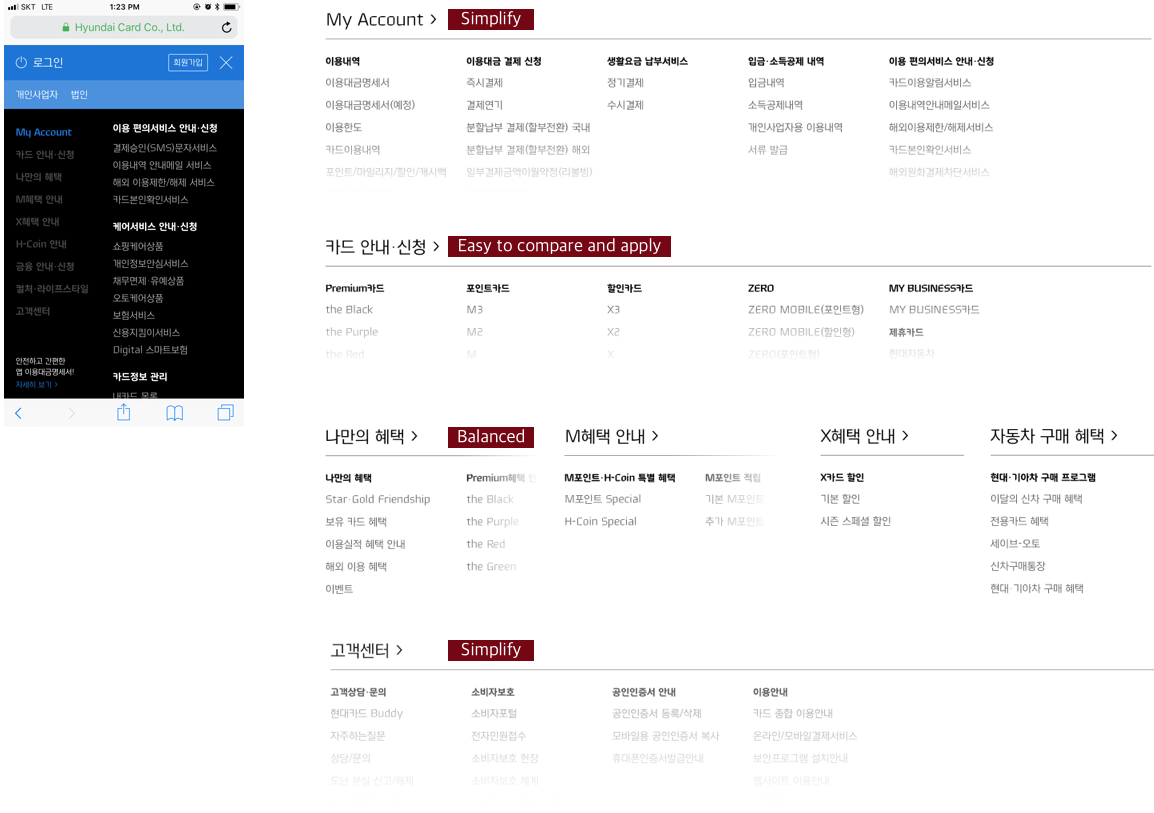
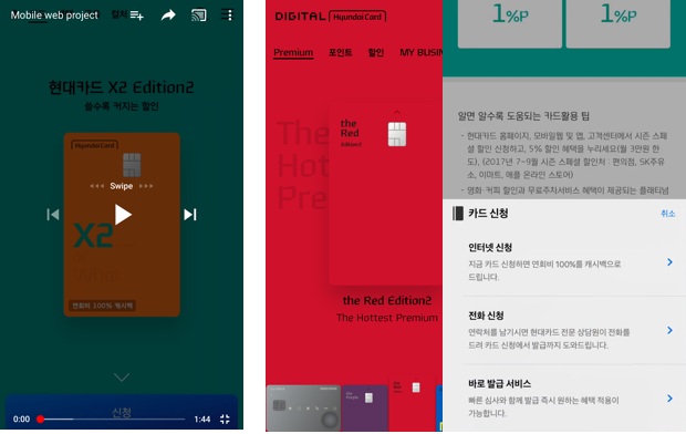
"현대카드 모바일 웹은 그 전까지 PC 화면을 스마트폰에 그대로 압축한 것이었습니다. 아무도 왜 그렇게 하는지 묻지 않았습니다."
"Hyundaicard's mobile web was nothing but the desktop site compressed onto a phone screen. Nobody asked why."
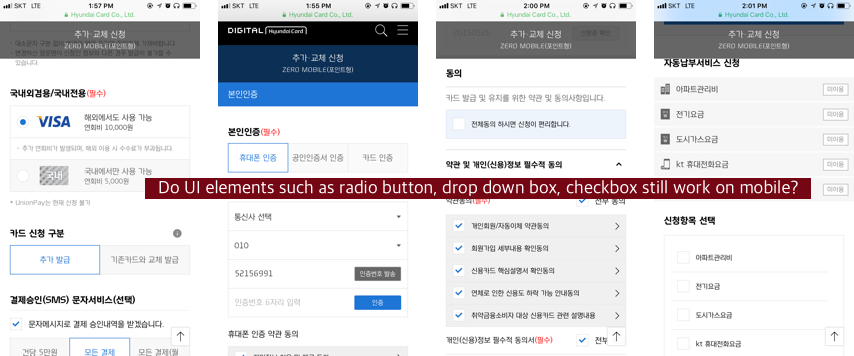
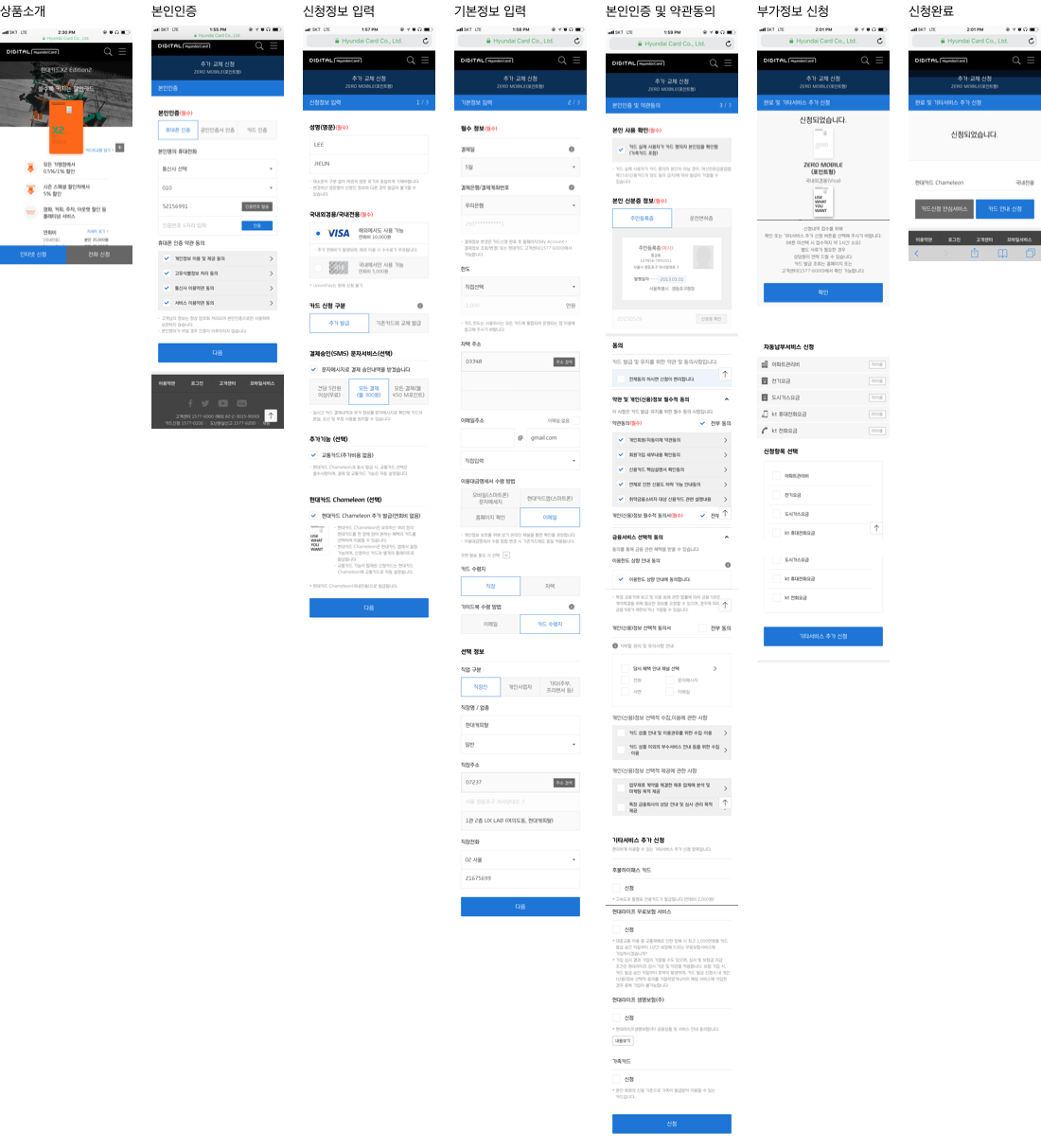
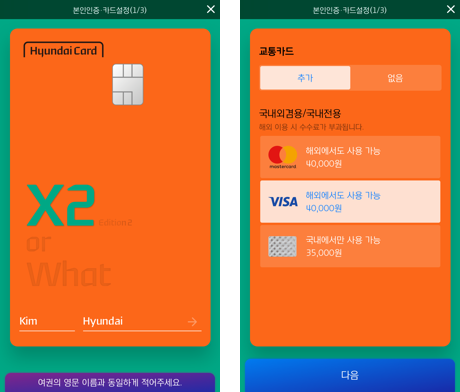
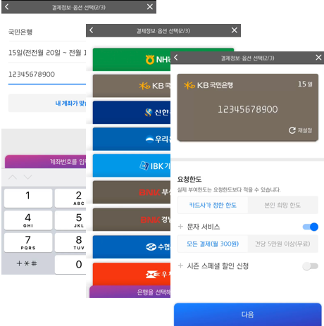
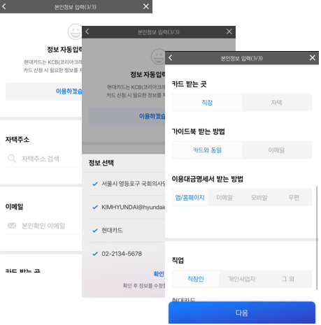
문제는 크게 두 가지였습니다. 첫째, 입력 방식의 근본적 차이를 무시했습니다. PC 웹은 키보드와 마우스를 전제로 설계되어 있습니다. 그것을 손가락으로 쓰게 했을 때 발생하는 UX 손실은 단순한 버튼 크기 문제가 아닙니다.
The problem was twofold. First, it ignored the fundamental difference in input methods. PC web is designed for keyboard and mouse. The UX loss when you force finger use isn't just about button size.
둘째, 모바일에서 금융을 하는 사람들의 맥락이 달랐습니다. 이동 중, 짧은 시간, 명확한 단일 목적 — 이 맥락을 위한 설계가 전혀 없었습니다. Second, the context of people doing finance on mobile was different. In transit, in short time windows, with a single clear intent — there was no design for this context at all.
Research & Design Way
모바일 최적화를 정의하기 위해 우리는 먼저 디지털이 물리 세계와 어떻게 다른지를 분석했습니다. 사진 찍기, 음악 듣기, 뉴스 보기 — 모바일이 이를 가능하게 했을 때 사람들이 경험하는 것은 단순한 편의가 아니라 맥락의 전환입니다.
To define mobile optimization, we first analyzed how digital differs from the physical world. Taking photos, listening to music, reading news — when mobile made these possible, what people experienced wasn't just convenience, but a shift in context.
팀은 이를 "From Physical to Digital — Moving Beyond"로 정의하고, 세 가지 디자인 원칙을 도출했습니다: Origin, Immersion, Bold. We defined this as "From Physical to Digital — Moving Beyond" and derived three design principles: Origin, Immersion, Bold.
공유된 맥락에서 출발
Starting from shared context
현대카드가 오프라인에서 쌓아온 브랜드 경험과 디자인 언어를 디지털에서도 일관되게 이어갑니다. 새로운 모바일 환경이지만 브랜드의 뿌리를 잃지 않습니다.
Carrying the brand experience and design language Hyundaicard built offline consistently into digital. New mobile environment, but roots intact.
고요함 속의 집중
모바일은 방해 없는 몰입의 공간입니다. 사용자가 금융 작업에 집중할 수 있도록 불필요한 정보와 시각적 노이즈를 제거합니다. 침묵이 커뮤니케이션이 됩니다.
Mobile is a space for undistracted immersion. Remove unnecessary information and visual noise so users can focus on the financial task. Silence becomes communication.
전통을 벗어나는 결단
The decision to break from tradition
관행을 따르는 것이 아니라 모바일에서만 가능한 새로운 경험을 만듭니다. 현대카드 앱의 Perpetual β 철학을 모바일 웹에서도 이어받습니다.
Not following convention, but creating experiences only possible on mobile. Carrying forward the Perpetual β philosophy from the Hyundaicard app into mobile web.
IA — Information Architecture
PC 웹의 전체 메뉴 구조를 모바일에 그대로 가져오는 것은 불가능했습니다. 모바일에서 사용자가 실제로 하는 것, 빈도, 맥락을 분석해 IA를 완전히 재구성했습니다.
It was impossible to bring the full PC menu structure straight to mobile. We completely restructured the IA based on analysis of what users actually do on mobile, how often, and in what context.
카테고리 중심 깊은 계층
Category-first deep hierarchy
PC 메뉴 구조를 모바일에 그대로 이식. 카드 상품, 혜택, 결제, 마이페이지 등 10개 이상의 1단계 메뉴. 사용자는 원하는 기능에 도달하기 위해 3~4단계를 탐색해야 했습니다.
PC menu structure transplanted to mobile. 10+ top-level categories including products, benefits, payment, My Page. Users needed 3-4 taps to reach common tasks.
Task-first, Logo as anchor
사용자가 실제로 가장 자주 하는 3가지 작업(카드 신청, 결제 확인, 혜택 조회)을 홈에서 바로 접근하도록 설계. 로고는 단순 브랜딩이 아닌 네비게이션 앵커 역할을 담당하도록 재정의했습니다.
Designed so the 3 most common tasks (card apply, payment check, benefit lookup) are accessible from home immediately. Logo redefined not as mere branding but as a navigation anchor.
3 Big Impacts First
모든 화면을 동시에 재설계하는 대신, 사용자 행동 데이터에서 가장 빈도가 높고 이탈률이 높은 3개 영역에 먼저 집중했습니다.
Instead of redesigning all screens simultaneously, we focused first on the 3 areas with the highest frequency and highest drop-off in user behavior data.
Home
첫 화면의 목적 재정의
Redefining the purpose of the first screen
기존 홈은 마케팅 배너와 상품 소개 중심이었습니다. 재설계한 홈은 사용자가 가장 자주 하는 작업으로 즉시 접근할 수 있는 Task Hub입니다. 상단에 카드 정보(이번 달 결제 금액, 혜택 잔액)를 요약 형태로 배치하고, 아래에 주요 작업 바로가기를 구성했습니다.
The original home was marketing banners and product introductions. The redesigned home is a Task Hub giving immediate access to users' most common actions. Card info (this month's payment, benefit balance) summarized at top, major task shortcuts below.
카드 정보 요약 카드 — 스크롤 없이 잔액과 결제일 확인
Card summary widget — balance and payment date at a glance without scrolling
개인화 혜택 추천 — 사용 패턴 기반 혜택을 홈에서 바로 노출
Personalized benefit recommendations — usage-pattern based benefits visible from home
Card Apply
신청이 시작되는 순간부터 경험
Experience from the moment application begins
카드 신청 프로세스에서 가장 큰 이탈 지점은 첫 단계였습니다. 기존 방식은 긴 약관 동의와 개인정보 입력이 먼저였습니다. 재설계된 신청 흐름은 카드에 이름을 새기는 순간부터 시작합니다 — 고객이 이미 선택을 마친 것처럼 느끼도록.
The biggest drop-off in the card application process was at the first step. The old flow started with lengthy terms and personal information forms. The redesigned flow starts from the moment of putting your name on the card — making customers feel they've already decided.
이름 입력이 신청의 시작 — 소유감을 먼저 만든 뒤 세부 정보 입력
Name input as the start — create ownership feeling first, details later
신용정보 자동 불러오기 — 사용자가 직접 입력해야 하는 항목 대폭 감소
Auto-fetch credit data — drastically reducing fields users need to fill in manually
진행 단계 시각화 — 어느 지점에 있는지, 얼마나 남았는지 명확하게
Progress visualization — clear indication of current step and remaining steps
Finance Apply
금융 신청의 불안을 줄이다
Reducing the anxiety of financial applications
금융 서비스 신청 흐름에서 사용자의 가장 큰 장벽은 심리적인 것이었습니다. "내가 승인받을 수 있는가?"의 불안. 재설계된 Finance Apply 흐름은 사용자가 먼저 한도를 확인한 뒤 신청하는 구조로 전환해 이 불안을 해소했습니다.
The biggest barrier in financial application flows was psychological — "Will I even get approved?" The redesigned Finance Apply flow resolved this by letting users check their eligible limit before formally applying.
사전 한도 조회 → 신청 구조 — 거절 불안 없이 신청 여부 결정 가능
Pre-check limit → apply structure — users can decide whether to apply without fear of rejection
안내 메시지 + 확인 버튼 디자인 — 카드 에디터에서 착안한 가이드 UX
Guide message + confirm button design — guidance UX inspired by card editor
애니메이션으로 대기 불안 경감 — 심사 중 로딩 대신 의미 있는 피드백
Animation to reduce waiting anxiety — meaningful feedback instead of a plain loading state
각 주요 화면의 이전 상태와 재설계 후 상태를 비교합니다. 핵심은 축소가 아니라 재정의입니다.
Comparing the before and after of each major screen. The key wasn't reduction — it was redefinition.
Home
마케팅 배너 + 카테고리 탐색 구조
Marketing banners + category navigation structure
카드 정보 요약 카드 + 주요 작업 바로가기
Card info summary + task shortcuts
Card Apply
약관 동의 → 개인정보 입력 → 카드 선택
Terms agreement → personal info → card selection
카드에 이름 새기기 → 자동 정보 불러오기 → 확인
Name on card → auto-fetch info → confirm
Finance Apply
신청 먼저 → 긴 대기 → 결과(거절 불안)
Apply first → long wait → result (rejection anxiety)
한도 먼저 확인 → 신청 여부 결정 → 자동 정보 불러오기
Check limit first → decide to apply → auto-fetch info
Reflection
"모바일 최적화는 크기를 줄이는 일이 아니다. 모바일에서 사람들이 원하는 것을 처음부터 다시 정의하는 일이다."
"Mobile optimization isn't about reducing size. It's about redefining from scratch what people want on mobile."
이 프로젝트에서 가장 어려운 것은 기술이 아니었습니다. 관행을 의심하는 것이었습니다. PC 웹을 기준으로 만들어진 모든 가정을 내려놓고, 손가락과 맥락을 먼저 생각하는 것. Perpetual β 철학 — Make, Break, Make — 은 앱에 이어 모바일 웹에서도 그 진가를 발휘했습니다.
The hardest part of this project wasn't technology. It was questioning convention. Setting aside every assumption built around the PC web, and thinking first about fingers and context. The Perpetual β philosophy — Make, Break, Make — proved its value again, from app to mobile web.