Simple · Principles
단순함은 줄이는 것이 아니라, 올바른 순서를 찾는 것 Simplicity isn't about removing — it's about finding the right order
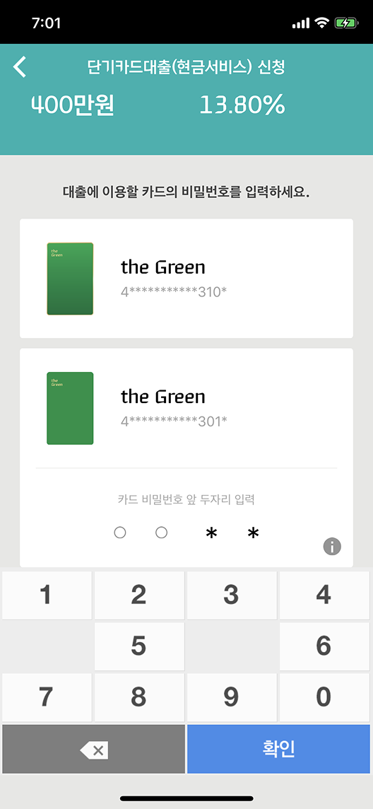
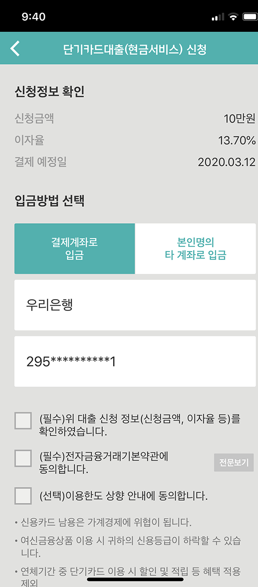
Simple · 01
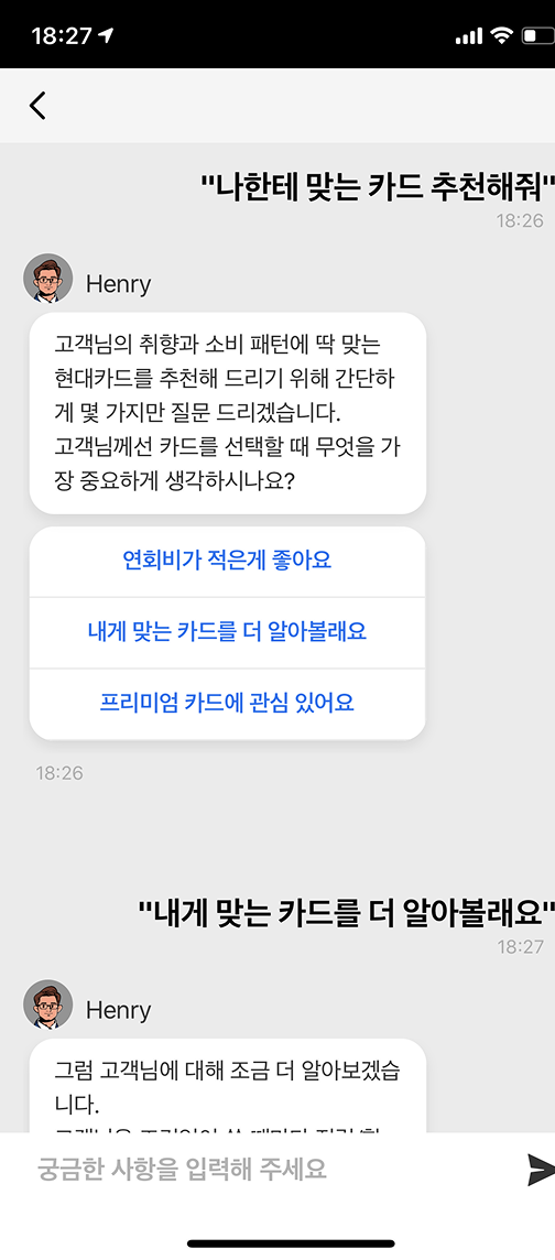
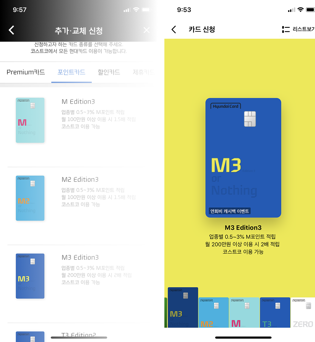
한 번에 하나씩, 순서대로 One step at a time, in order
One step at One time One step at One time
한 화면에 너무 많은 정보와 선택이 있으면 사용자는 멈춥니다. 각 단계에서 사용자에게 요구하는 것을 하나로 줄이고, 이전 단계에서 입력한 정보는 다시 입력하지 않아도 됩니다. 흐름이 명확해지면 사용자는 생각하지 않고 다음 단계로 넘어갑니다. Too much information and too many choices on one screen stops users cold. We reduced each step to a single ask, and reused information entered in previous steps. When the flow is clear, users move to the next step without thinking.
단계별 진행 → 완료율 향상 Step-by-step flow → Higher completion rate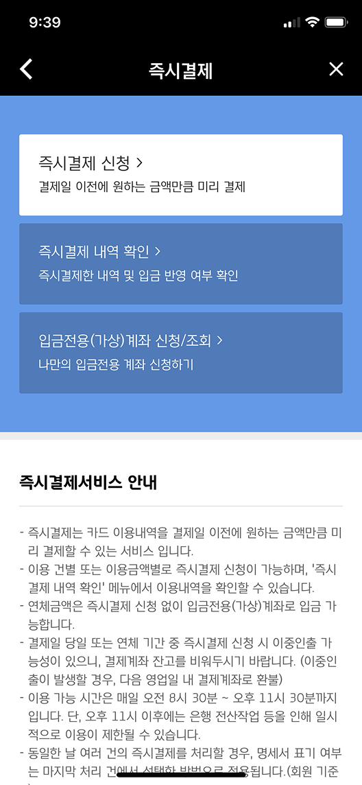
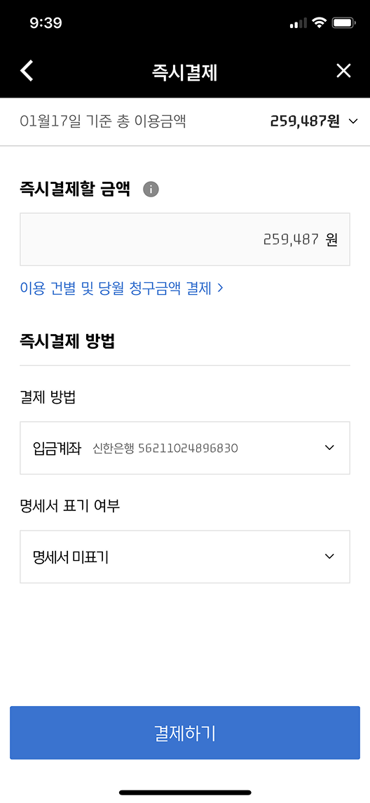

Simple · 02
직관적인 색상과 큰 터치 영역 Intuitive color and big touch targets
Intuitive color and big buttons Intuitive color and big buttons
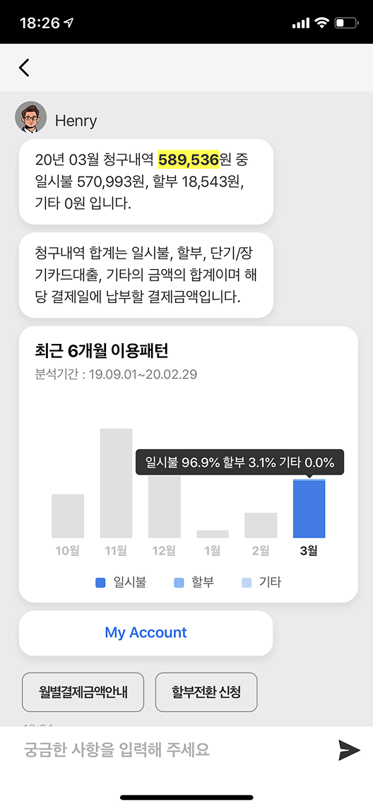
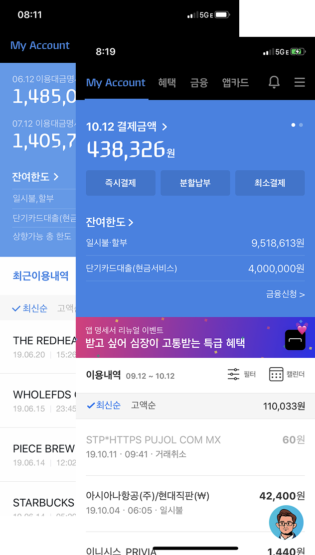
이번 달 결제 예정 금액에만 집중할 수 있도록 다음 달 결제와 분리했습니다. 가장 자주 쓰는 기능은 더 크게 만들어 터치하기 쉽게 했습니다. 중요한 숫자와 정보는 색상으로 구분해 스캔에 최적화했습니다. We separated this month's payment from the next month's to allow focus. The most frequently used elements became bigger for easier touch. Key numbers and information were differentiated by color for scan optimization.
사용 빈도 기반 레이아웃 우선순위 Layout priority based on usage frequency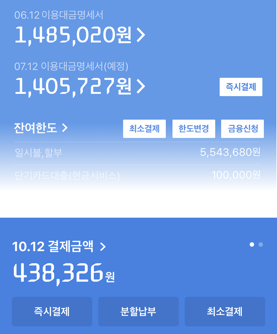
Simple · 03
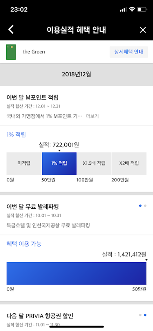
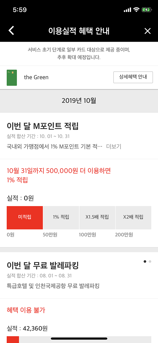
소비 데이터로 혜택을 즉각 확인 Check benefits instantly from spending data
At a glance benefit check At a glance benefit check
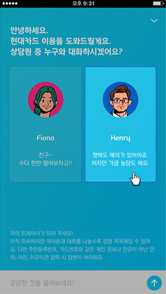
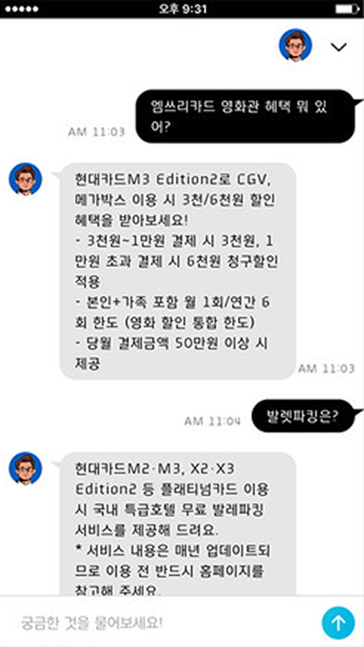
소비 데이터를 기반으로 어떤 혜택이 가능한지 한눈에 확인. 중요한 정보를 하이라이팅해 스캔 속도를 높였습니다. 베타 서비스에서 배운 것: 자연어 문장보다 버튼, 복수 선택 같은 더 쉬운 옵션이 완료율을 높입니다. View available benefits at a glance based on spending data. Highlighting important information speeds scanning. Lesson from beta: easier options like buttons and multiple choice outperform natural language lines for completion rates.
베타 테스트 → 인터랙션 패턴 개선 Beta test → Interaction pattern improvement