The new start of ALM Strategy
Hyundai Capital service renewal
* ALM: Auto loan + (Credit) Loan + Mortgage
Download Android Appstore Visit website

Overview
현대캐피탈은 다른 제2금융권과는 달리 신용도가 우수한 현대 기아 자동차 고객이 있음에도 로그인하는 고객이 1% 밖에 되지 않아 이 우량한 고객들에게 다른 상품을 추천할 방법이 없었죠. 그래서 기존에는 모든 채널을 동일한 모습으로 구성했던 것과 달리 웹은 매스 고객 대상으로 가장 빠른 상품 비교와 신청 채널로, 앱은 기존 고객 대상 로열티 강화 및 재이용 유도 채널로 전략을 바꿨습니다.
Although Hyundai Capital has customers with good credit scores that are acquired by Hyundai/KIA auto loan than competitors, they couldn’t offer other products because most of customers didn’t log in after. So we changed our online strategy to web for acquisition for mass customers, app for building loyalty for those who already use Hyundai capital service.
-
Role
Senior UX designer / Cell leader
-
Skills
Sketch
Invision
Protopie -
Time
Feb 2016 - Jun 2017
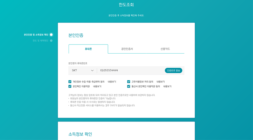
Problem
캐피탈 상품은 대부분 한 번 이용하고 나면 매달 같은 금액을 갚는 방식이기 때문에 이용한 후에는 사이트에 방문할 이유가 없어 로그인 고객이 10%도 되지 않아 기존 고객에게 마케팅 동의를 얻지 않는 한 재이용을 추천할 수 있는 방법이 거의 없었습니다. 또 고객 입장에서 매달 잘 갚아도 신용도를 유지할 뿐 별 도움이 되지 않는, 즉 일회성으로 필요에 의해 이용할 뿐 더 깊은 관계를 맺지는 못했습니다.
Only 10% or less of Hyundai capital customers logged in because they don’t have reasons to visit after using their service. Therefore we couldn’t offer any finance that our customers may need in their life cycle unless they agreed to getting marketing news. On the customers’ side, there is no benefit no matter if they never miss a due but just keep their credit score. It seems the relationship between the company and our customers are one-time only.
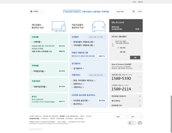
Desktop
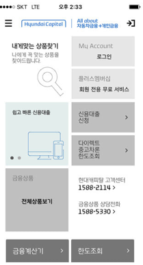
Mobile
Research & Ideation
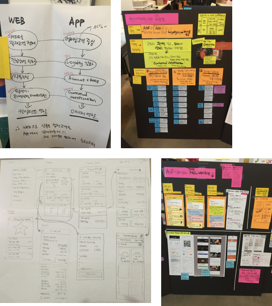
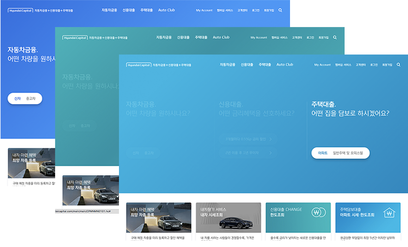
기존 웹사이트와 앱은 동일한 디자인, 동일한 서비스를 제공하고 있었습니다. 그러나 고객의 이용 패턴을 살펴본 결과 검색을 통해 웹으로 유입되어 여러 회사의 한도와 금리를 비교하고 신청하고, 기존에 상품 이용 경험이 있는 고객은 앱을 통해 로그인해서 상환에 관련된 업무들을 수행하는 패턴을 확인할 수 있었습니다.
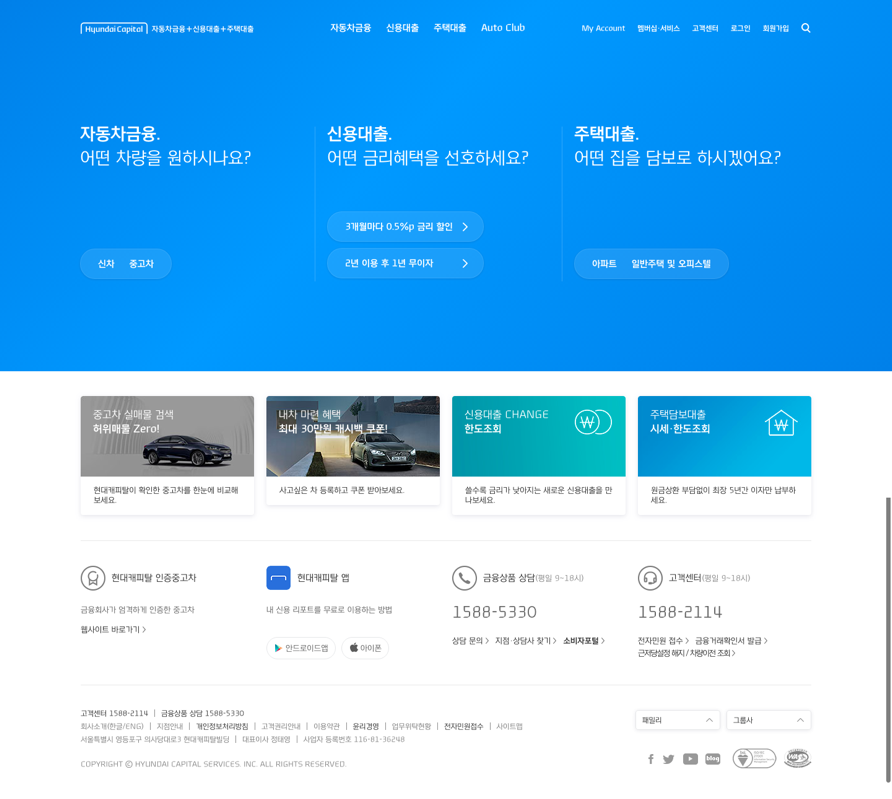
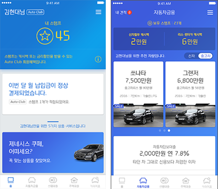
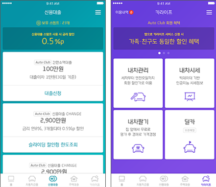
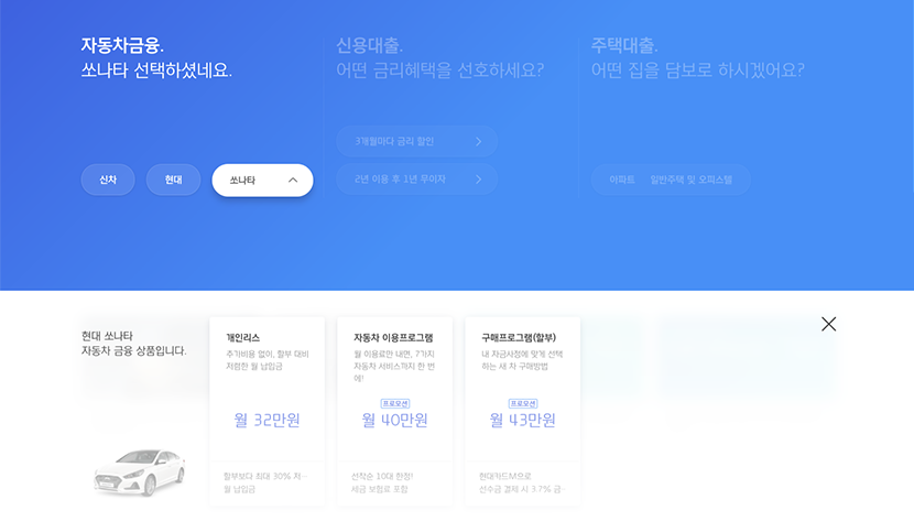
따라서 우리는 기존 웹은 매스 고객 대상으로 가장 빠르고 쉽게 상품을 비교하고 신청할 수 있는 채널로, 앱은 기존 고객 대상으로 “이용해줘서 고맙습니다. 또 이용해 주세요” 라는 로열티 형성 및 재이용 유도 채널로 포지셔닝했습니다.
Previously, all the online channels provided the same look and services. When we looked deeper, however, our customers visited the website through searching on the internet to compare interest rates to other banks while they use the app to do tasks that are related to pay off.
Thus we repositioned the roles of each channel as the web for the mass customers to compare our products and apply easily and the app for the acquired customers to build up loyalty and offer better deals so that they use our service again.
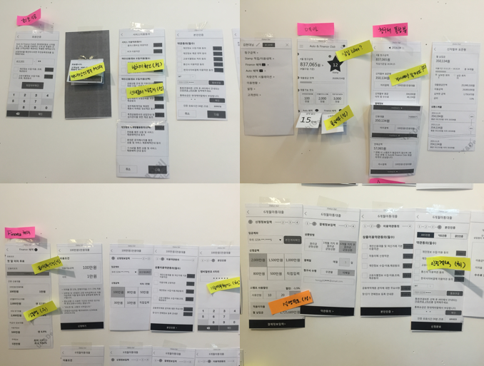
Wireframes / Low fidelity Prototype
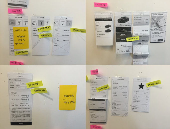
A/B test
Design Keywords
-
CLEAR
Providing finance information understandable -
FLEXIBLE
Chages according to behavior -
SAMANTHA
Kind interaction with users
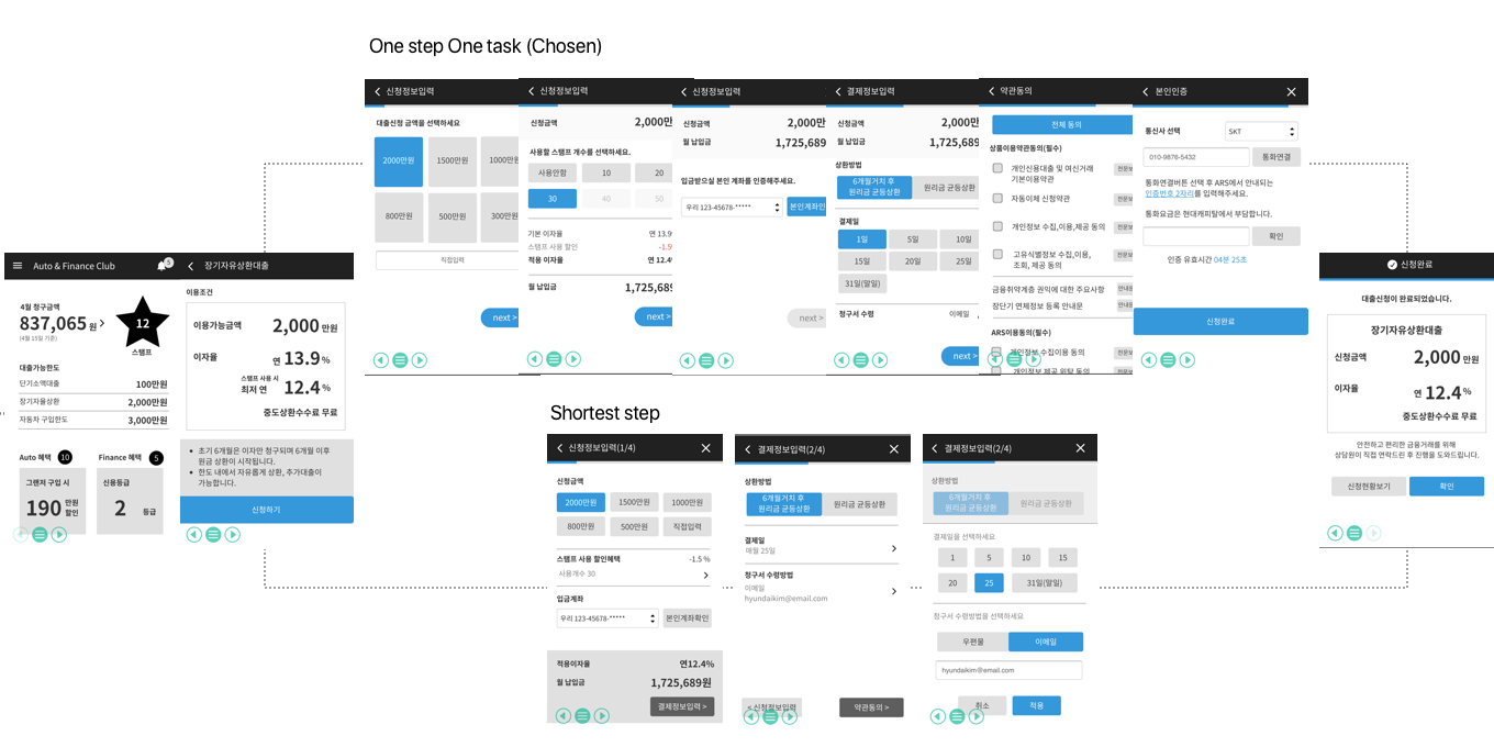
Final design
Clear
Live expression > still images or text
Live expression that is easy to focus and simple is prefered than still image or text
Clear information that indicates its status
Flexible
Changing interface that follows user’s behavior
 Tansitioneffects that do not interupt user context than change the whole page
Different layout according to their purpose instead of design guide that is applied regardless of context
 Card layout for application page that is distinguished from information page and easy to focus
Smantha
Responsive design elements allied with user behavior as a reaction for user’s action so that calls emotional reaction from them
 Gradient transition follows by user’s choice
Kind and soft word tone in communication
 Easy vocabulary and inforgraphic than difficult finance terms
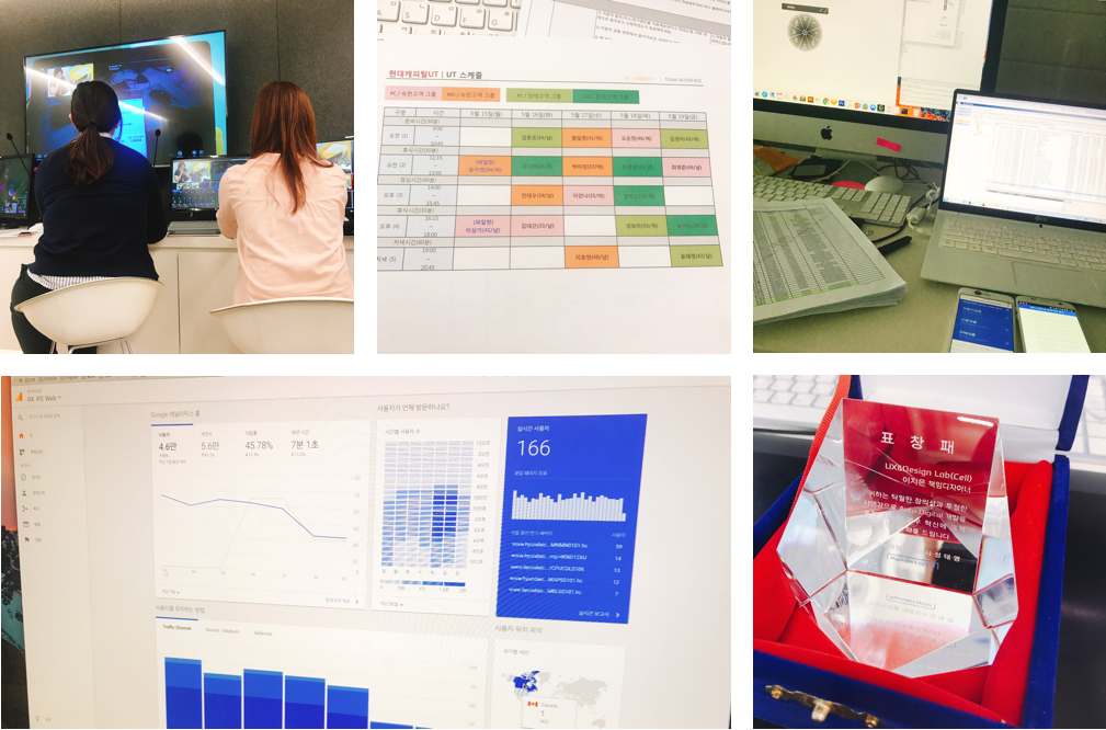
Develop & User test